Line charts
Examples
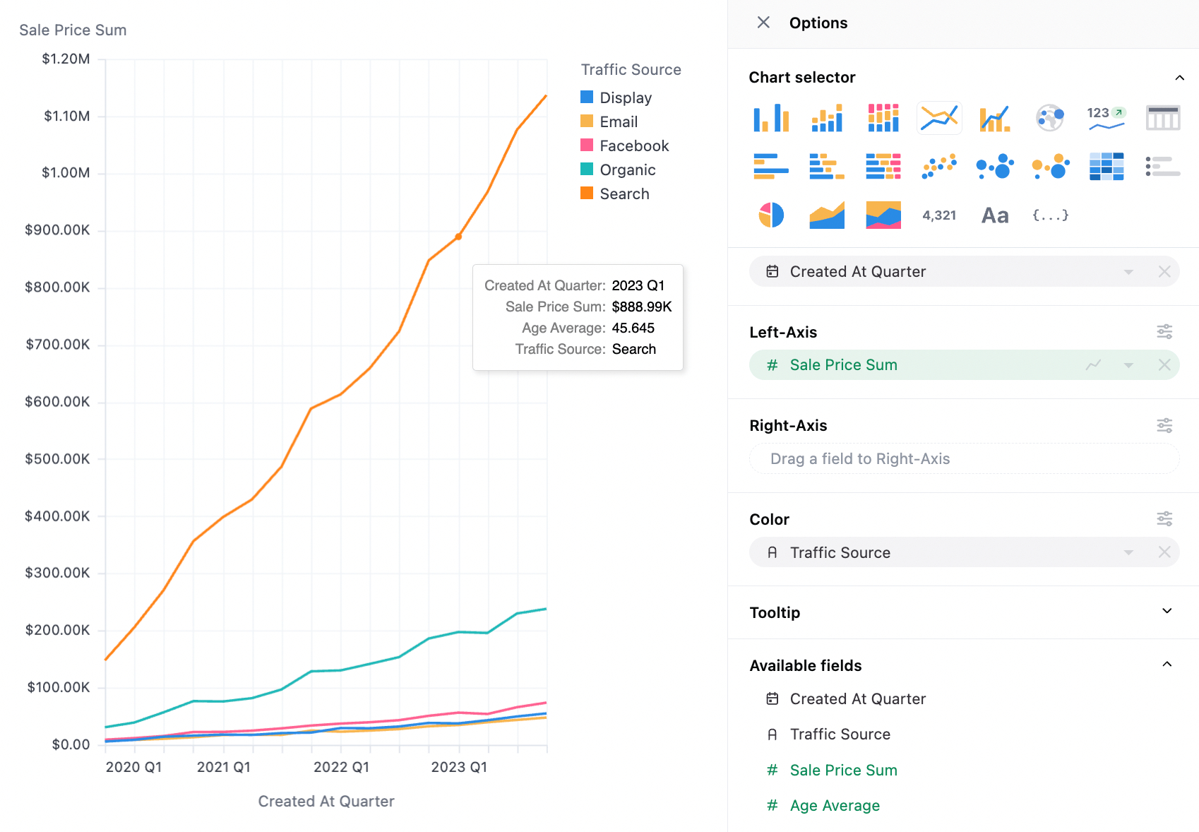
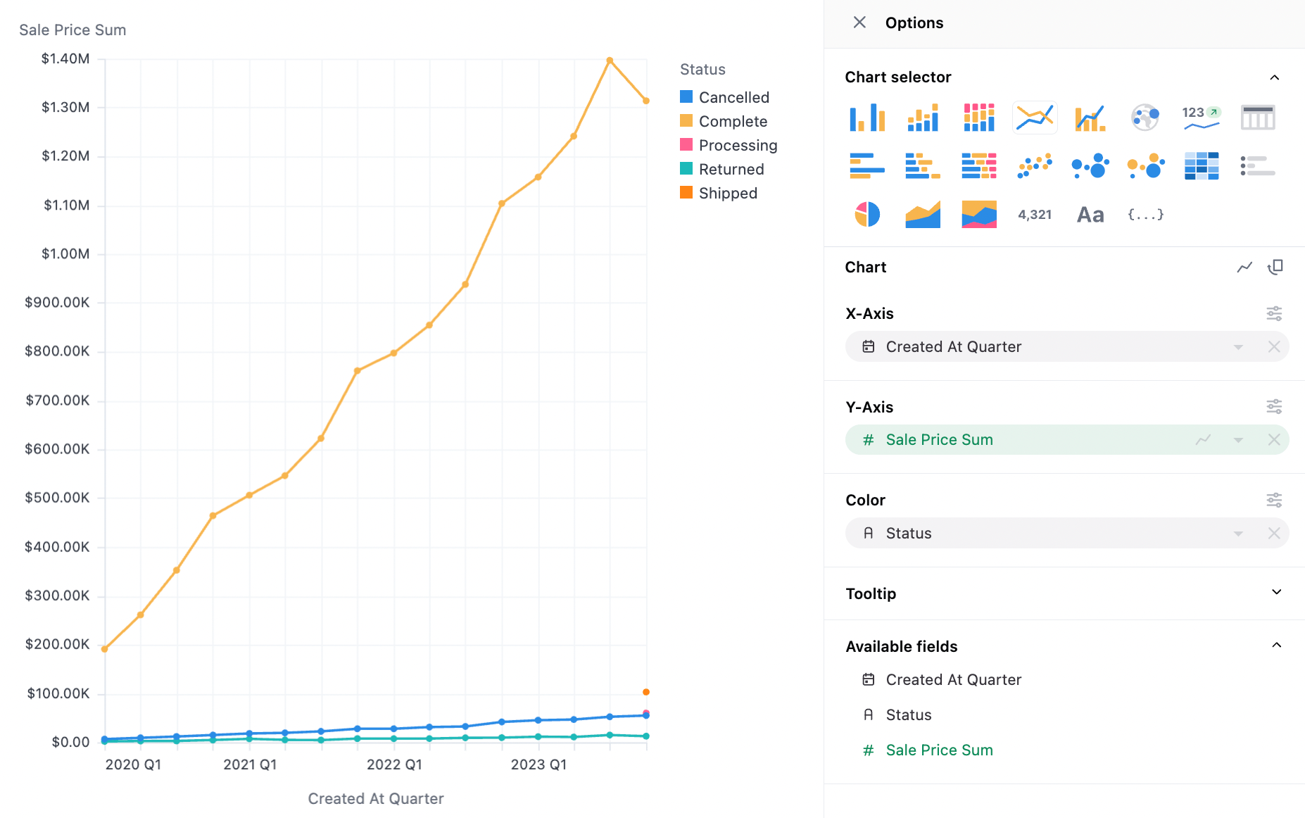
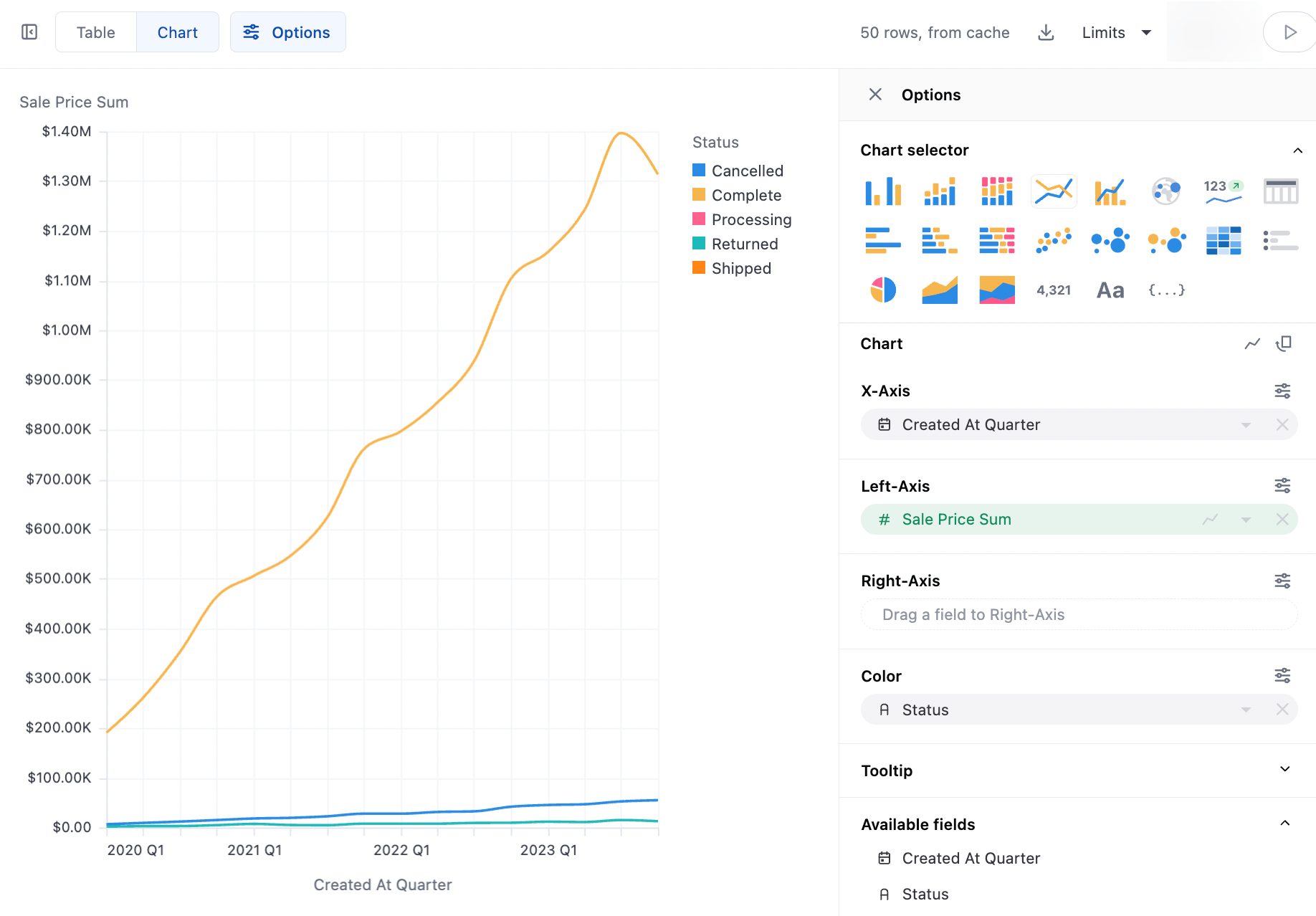
Section titled “Examples”Basic Lines:
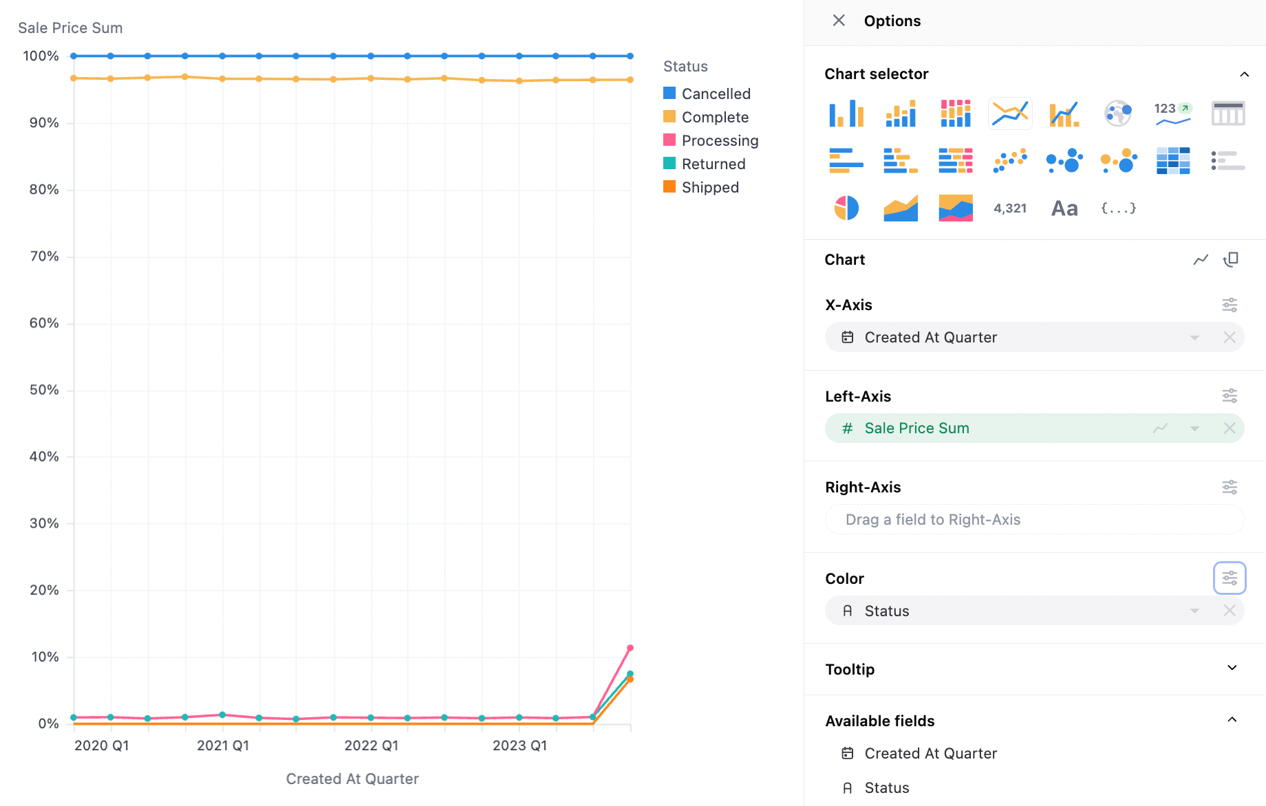
Stack 100:
Monotone:
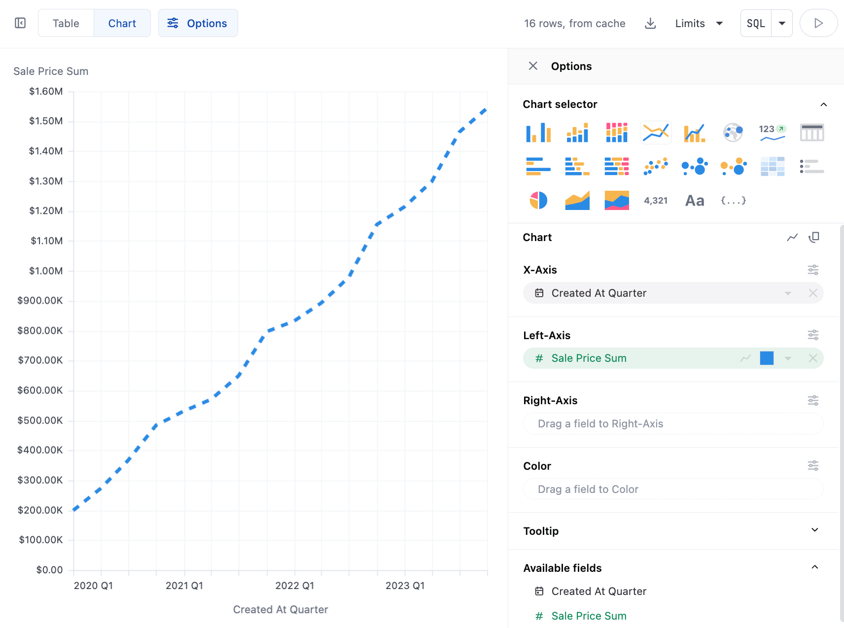
Dashed:
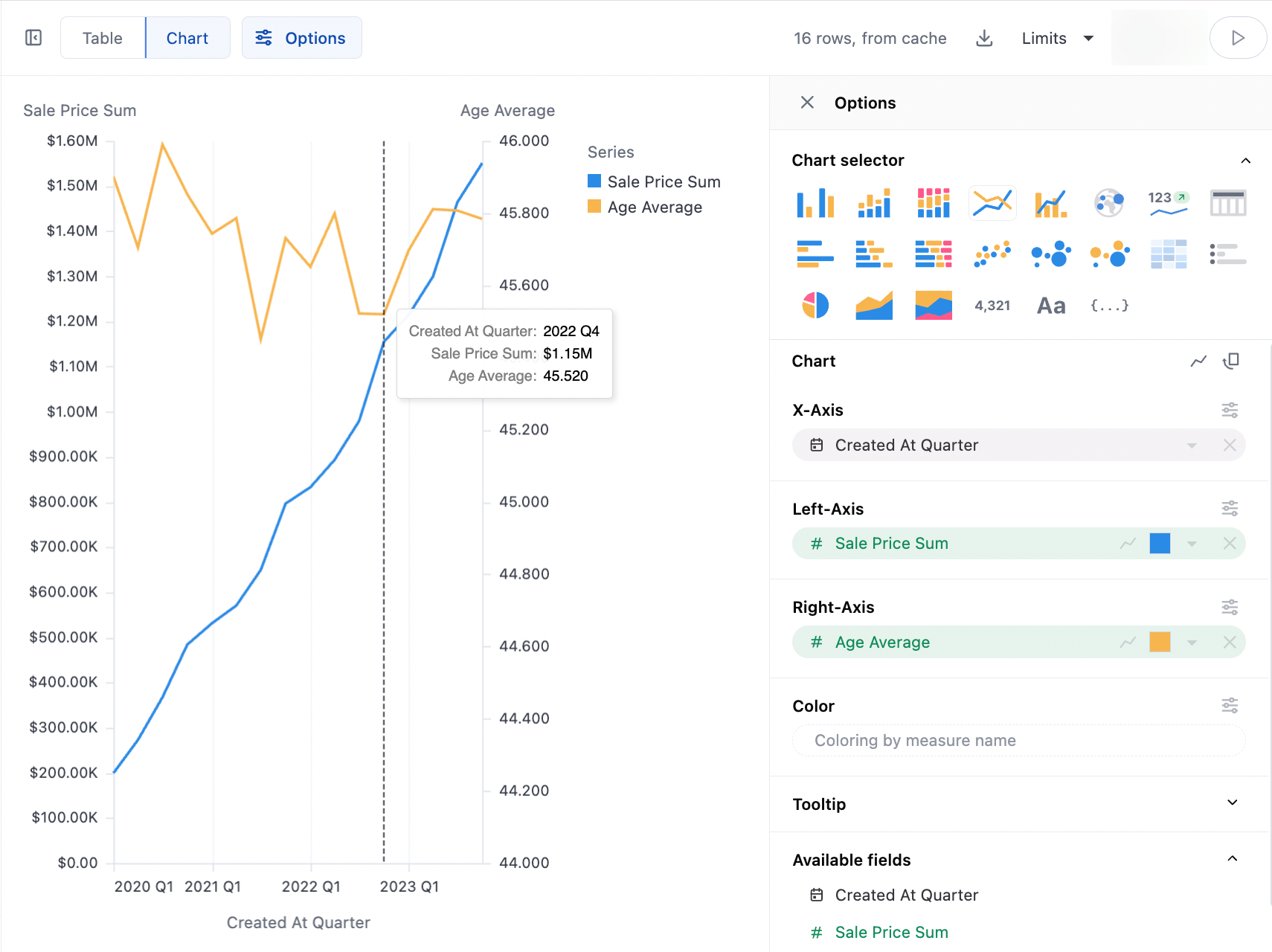
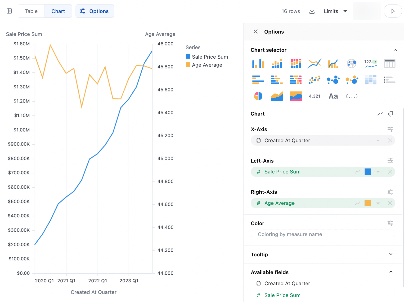
Dual Axes:
Data Structures
Section titled “Data Structures”Line charts can work with pivoted or unpivoted data, using 2 dimensions and one measure. To stack or group a chart, one series should be moved to the color facet.
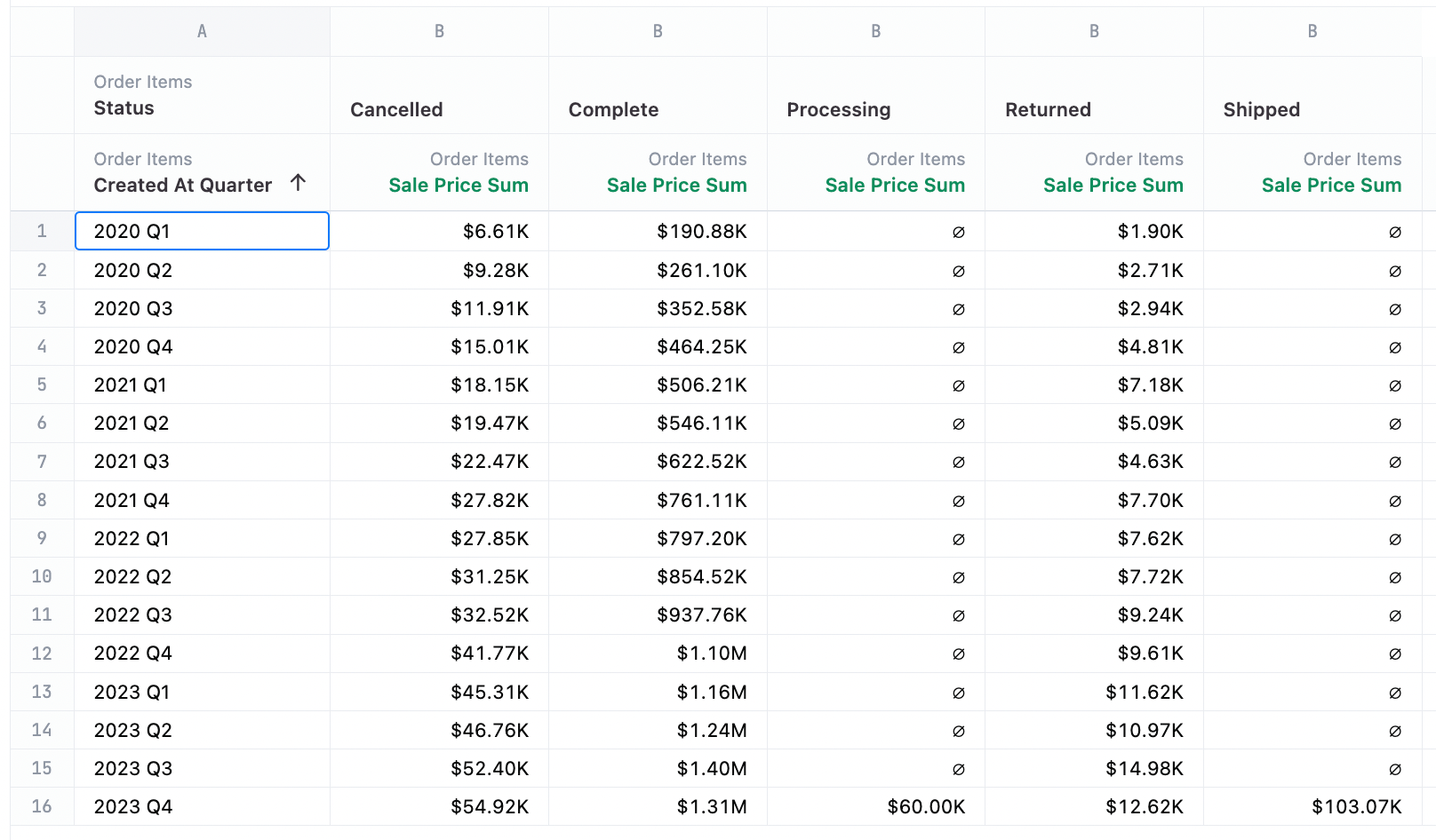
Unpivoted Data:
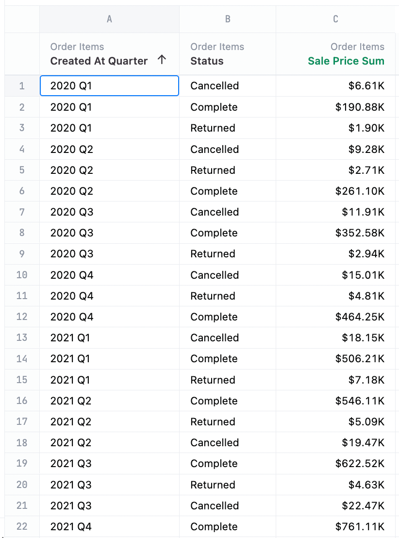
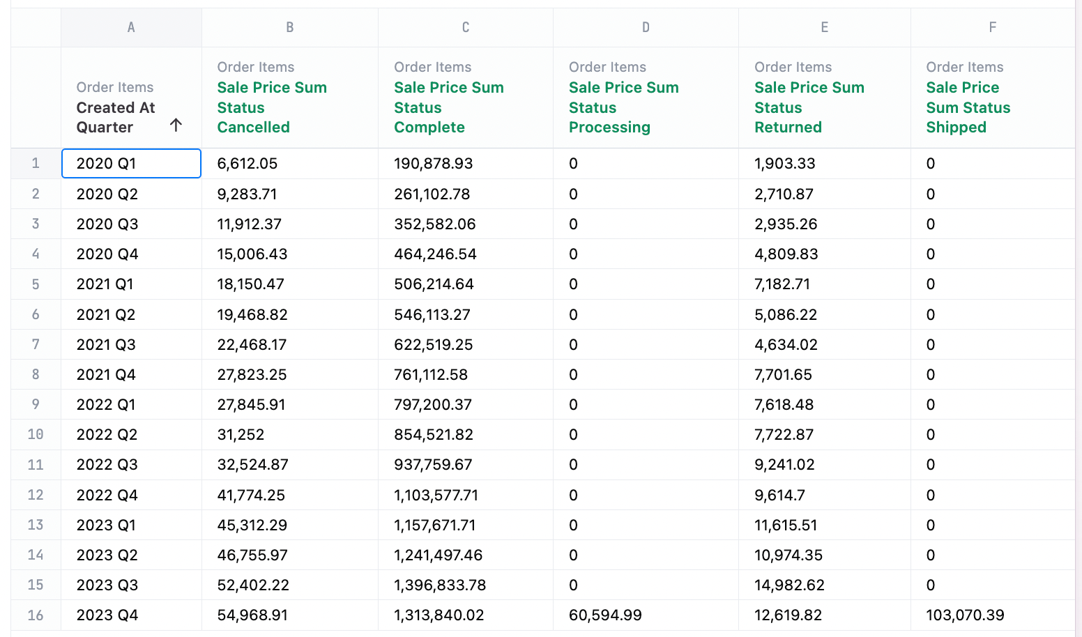
Pivoted Data
Additionally line charts can plot using several measures at once:
Line Configuration Notes
Section titled “Line Configuration Notes”Several configuration options are offered for how lines appear, including showing points, style, weight, interpolation, points
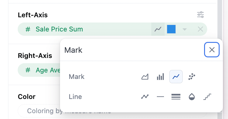
Line Mark
Section titled “Line Mark”This is the line icon on each axis, and holds all of the overall configuration options.
Show Points
Section titled “Show Points”Points can be toggles on/off to show alongside the lines (default contains no points).
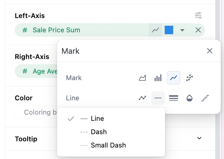
Dashes vs Solid Lines
Section titled “Dashes vs Solid Lines”Whether or not series are shown as solid lines or dashed lines is available (default solid).
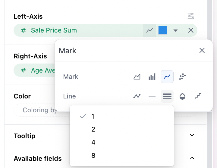
Line Thickness
Section titled “Line Thickness”The weight or thickness can be controlled (default 1).
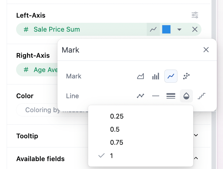
Line Opacity
Section titled “Line Opacity”Setting is available to make the line partially transparent (default solid).
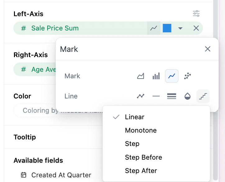
Point Interpolation for Lines
Section titled “Point Interpolation for Lines”The method for interpolation between points can be controlled (default linear). Options include:
- Linear
- Monotone (smoothed)
- Step (point at midpoint of the step)
- Step Before
- Step After
Overall Configuration Notes
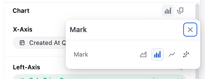
Section titled “Overall Configuration Notes”The mark selector at the top of the configuration sets the global chart configuration (configuration across all series). Note that each series can be set independently to bar, line, scatter, area independently under their y-axis controls
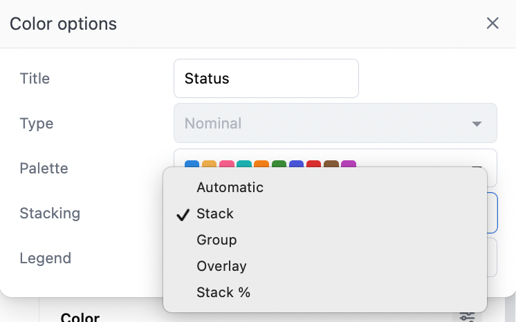
The color section controls overall stacking and grouping behavior overall. Additionally stack can be set independently on the different y-axis, under the y-axis series configuration (useful for overall grouping of two stacked grouplets):
- Automatic: we’ll guess for you
- Stack: Series on same x-axis value, ontop of each other
- Group: Series offset from their baseline x-axis mark into grouplets
- Overlay: Series ontop of each other (usually very undesirable, but useful in rare cases)
- Stack %: Series rebased to 100% across each x-axis value
Other Notes
Section titled “Other Notes”-
Time dimension axes are set to temporal with lines, meaning points will be displayed along a continuous time axis. For charts where ordinal behavior is desired, it’s recommended to toggle the individual series from a bar chart accelerator.
-
With time fields, order will be automatically set to ascending; other data types will obey the table ordering when graphing
-
Tooltips have two styles (see below):
- On line charts with multiple measures, hover will highlight all available series along the x-axis vertically, vs just the series being hovered.
- On line charts with a dimension mapped to color (and a single measure), the hover will only show the nearest point