Custom visualizations
iframe custom visualizations
Section titled “iframe custom visualizations”One way to create a custom visualization is to leverage an iframe tag in a Markdown tiles. The data in results + postMessages will render your custom iframes and provide a ton of flexibility.
For example:
<iframe src="https://example.html"></iframe>Note: Included images won’t render if they are scheduled. Additionally, the file must be hosted outside of JustAsk.
Vega-Lite visualizations
Section titled “Vega-Lite visualizations”Many of JustAsk’s charts are backed by Vega-Lite, which is a JSON-based spec for visualizations. You can directly edit a chart’s code to customize it beyond what JustAsk provides out of the box.
If you are unfamiliar with Vega-Lite, check out the Vega-Lite documentation before perusing the example gallery.
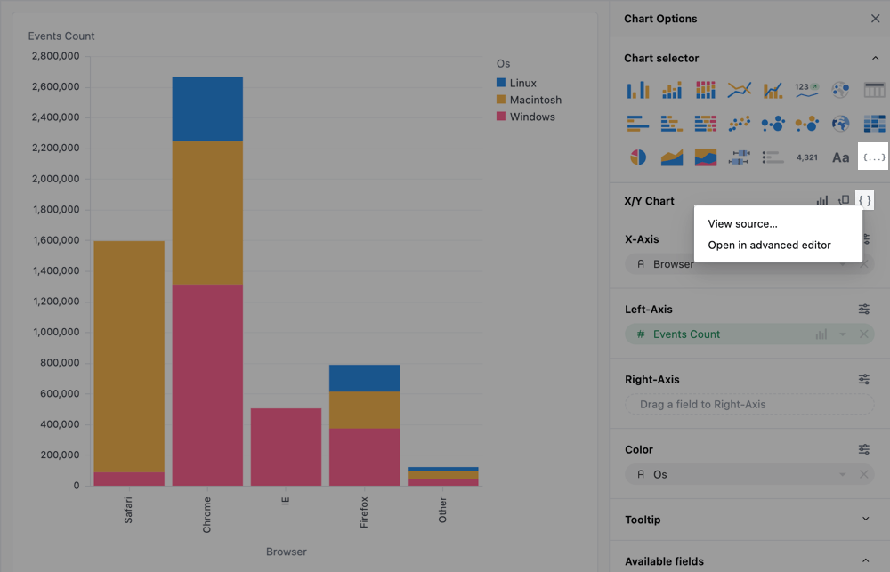
Accessing the advanced editor
Section titled “Accessing the advanced editor”In the Chart tab of any workbook query, there are two ways to access the advanced editor:
-
In the Chart selector - Click the
{ ... }icon to select the Vega code option. This will open the advanced editor, but without any pre-populated Vega code. This can be useful to start from scratch, such as with an example from Vega or one from the example gallery on this page. -
In the chart editor - For any chart powered by Vega-Lite, there will be a
{ }icon in the chart editor. Clicking it will open a menu with the following options:- View source - Opens a dialog with the Vega-Lite JSON
- Open in advanced editor - Copies the current chart code and opens it in the Advanced editor
Referencing data in the advanced editor
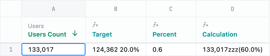
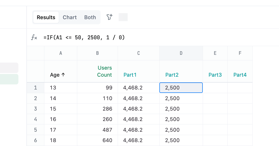
Section titled “Referencing data in the advanced editor”To use data from the results query, you’ll need to reference the field by its view and field name as they are defined in the model. This will look like view_name\\.field_name in the editor.
The double forward-slashes (\\) are included because periods and brackets must be escaped. For example:
| JustAsk object | Vega object |
|---|---|
users.id | users\\.id |
users.age | users\\.age |
users.created_at | users\\.created_at |
users.created_at[date] | users\\.created_at\\[date\\] |
users.created_at[month] | users\\.created_at\\[month\\] |
id | id |
Note: In the last example, id would only occur from a raw SQL query as JustAsk will alias with the view.
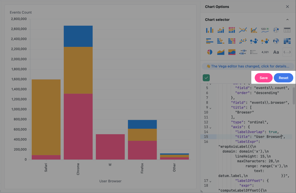
Saving and resetting changes
Section titled “Saving and resetting changes”Custom visualizations must be manually saved. While the visualization will update as you edit, the code is not auto-saved. Periodically click the Save button to save your changes.
To remove all edits made to the code, click Reset. This will revert the code to its original version.
Examples
Section titled “Examples”In addition to custom Vega-Lite visualizations, you can also build custom visualizations using HTML, CSS and Markdown. Check out the Markdown visualization examples for some inspiration.
US state map
Section titled “US state map”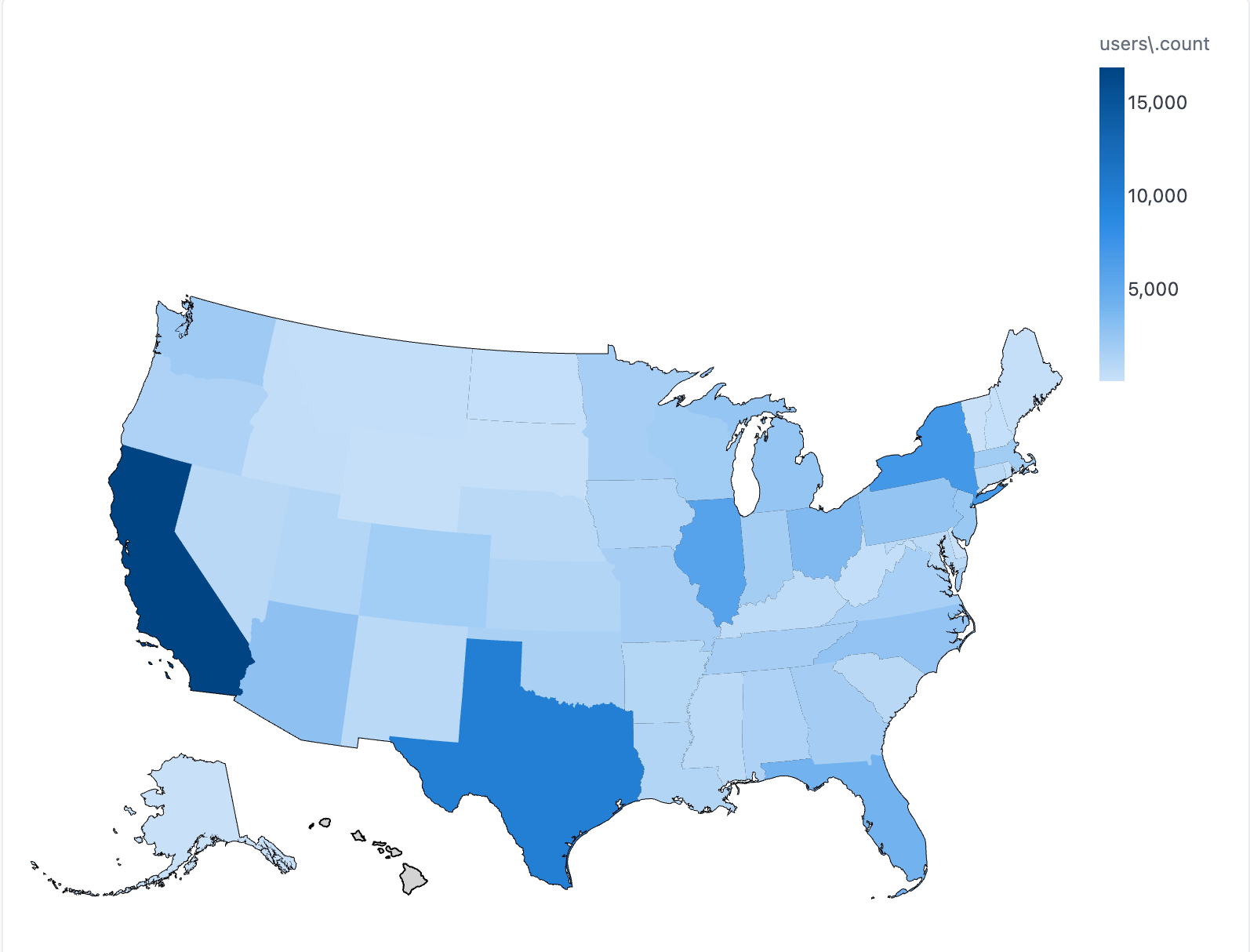
Query fields:
users.state- Full-length state names are required for this visualization. To remove the legend, add"legend":nullwithincolor{...users.user_count
{ "layer": [ { "data": { "url": "https://cdn.jsdelivr.net/npm/us-atlas@3/states-10m.json", "format": { "type": "topojson", "feature": "states" } }, "mark": { "fill": "lightgray", "type": "geoshape", "stroke": "black" } }, { "mark": "geoshape", "width": "container", "height": "container", "encoding": { "href": { "type": "nominal", "field": "url" }, "color": { "type": "quantitative", "field": "COLOR" }, "shape": { "type": "geojson", "field": "geo" }, "tooltip": [ { "field": "STATE", "title": "State" }, { "type": "quantitative", "field": "COLOR", "title": "User Count" } ] } } ], "width": "container", "height": "container", "transform": [ { "as": "STATE", "calculate": "datum['your_view.your_state']" }, { "as": "COLOR", "calculate": "datum['your_view.your_measure']" }, { "as": "geo", "from": { "key": "properties.name", "data": { "url": "https://cdn.jsdelivr.net/npm/us-atlas@3/states-10m.json", "format": { "type": "topojson", "feature": "states" } } }, "lookup": "STATE" }, { "as": "url", "calculate": "'https://your-instance.example.com/drill?field=users.count&row=%7B%22users.state%22%3A%22' + datum['users\\.state'] + '%22%7D' " } ], "projection": { "type": "albersUsa" }}US map with latitude and longitude
Section titled “US map with latitude and longitude”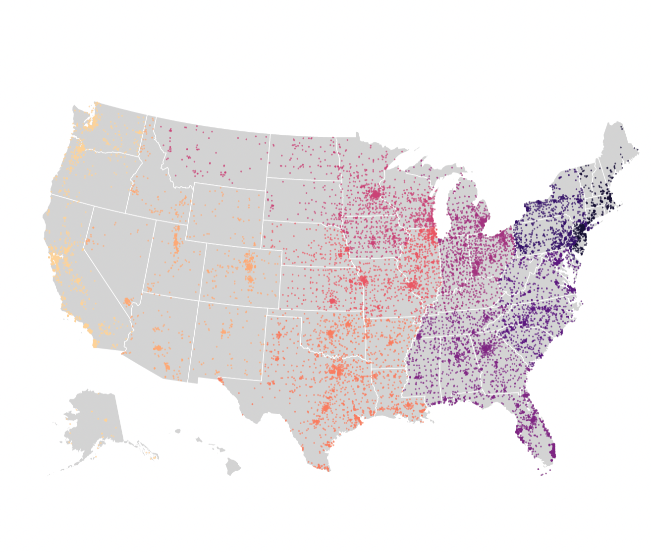
Query fields:
users.zipusers.zip_first_digitusers.latitude_averageusers.longitude_averageusers.user_count
{ "layer": [ { "data": { "url": "https://vega.github.io/editor/data/us-10m.json", "format": { "type": "topojson", "feature": "states" } }, "mark": { "fill": "lightgray", "type": "geoshape", "stroke": "white" } }, { "transform": [ { "as": "LATITUDE", "calculate": "datum['users\\.latitude_average']" }, { "as": "LONGITUDE", "calculate": "datum['users\\.longitude_average']" }, { "as": "COLOR", "calculate": "datum['calc_1']" } ], "mark": { "type": "circle", "tooltip": true }, "encoding": { "size": { "value": 5 }, "color": { "type": "nominal", "field": "COLOR", "scale": { "scheme": "magma" }, "legend": null }, "latitude": { "type": "quantitative", "field": "LATITUDE" }, "longitude": { "type": "quantitative", "field": "LONGITUDE" } } } ], "width": "container", "height": "container", "projection": { "type": "albersUsa" }}US map - zip code choropleth
Section titled “US map - zip code choropleth”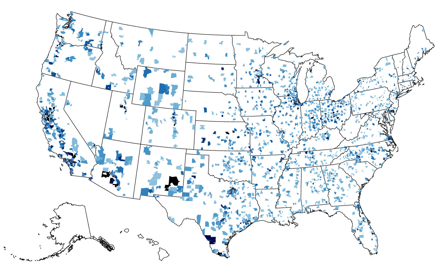
Query fields:
users.zipusers.user_count
{ "layer": [ { "data": { "url": "https://vega.github.io/editor/data/us-10m.json", "format": { "type": "topojson", "feature": "states" } }, "mark": { "fill": "white", "type": "geoshape", "stroke": "black" } }, { "mark": "geoshape", "width": "container", "height": "container", "encoding": { "color": { "type": "quantitative", "field": "users\\.count", "scale": { "domain": [ 0, 20 ], "scheme": "blues" }, "legend": null }, "shape": { "type": "geojson", "field": "geo" }, "tooltip": [ { "field": "ZIP" }, { "type": "quantitative", "field": "COLOR", "title": "Users Count" } ] } } ], "transform": [ { "as": "ZIP", "calculate": "datum['users.zip']" }, { "as": "COLOR", "calculate": "datum['users.count']" }, { "as": "geo", "from": { "key": "properties.zip", "data": { "url": "https://gist.githubusercontent.com/jefffriesen/6892860/raw/e1f82336dde8de0539a7bac7b8bc60a23d0ad788/zips_us_topo.json", "format": { "type": "topojson", "feature": "zip_codes_for_the_usa" } } }, "lookup": "ZIP" } ], "projection": { "type": "albersUsa" }}US map with labeled points
Section titled “US map with labeled points”
This visualization layers text marks directly inside colored coordinate points over a TopoJSON base map of the United States. It utilizes the albersUsa projection to automatically arrange the states appropriately.
Query fields:
-
view_name.latitude- The latitude coordinate of the point. -
view_name.longitude- The longitude coordinate (must be a negative number for the albersUsa projection). -
view_name.rank- The text value to display inside the map marker. -
view_name.category- The categorical field used to assign colors to the points. -
view_name.city- Additional detail for the hover tooltip. -
view_name.state- Additional detail for the hover tooltip.
{ "$schema": "https://vega.github.io/schema/vega-lite/v6.json", "data": { "name": "query" }, "width": "container", "height": "container", "projection": { "type": "albersUsa" }, "layer": [ { "data": { "url": "https://cdn.jsdelivr.net/npm/us-atlas@3/states-10m.json", "format": { "type": "topojson", "feature": "states" } }, "mark": { "type": "geoshape", "fill": "#e5e5e5", "stroke": "white", "strokeWidth": 1 } }, { "transform": [ { "calculate": "toNumber(datum['view_name.latitude'])", "as": "LATITUDE" }, { "calculate": "toNumber(datum['view_name.longitude'])", "as": "LONGITUDE" }, { "calculate": "datum['view_name.city']", "as": "CITY" }, { "calculate": "datum['view_name.state']", "as": "STATE" }, { "calculate": "datum['view_name.rank']", "as": "RANK" }, { "calculate": "datum['view_name.category']", "as": "COLOR_CAT" }, { "filter": "isValid(datum.LATITUDE) && isValid(datum.LONGITUDE)" } ], "encoding": { "longitude": { "field": "LONGITUDE", "type": "quantitative" }, "latitude": { "field": "LATITUDE", "type": "quantitative" }, "tooltip": [ { "field": "RANK", "type": "nominal", "title": "Rank" }, { "field": "CITY", "type": "nominal", "title": "City" }, { "field": "STATE", "type": "nominal", "title": "State" } ] }, "layer": [ { "mark": { "type": "circle", "size": 300, "stroke": "white", "strokeWidth": 1.5, "opacity": 1 }, "encoding": { "color": { "field": "COLOR_CAT", "type": "nominal", "scale": { "range": ["#F2B21B", "#6EC1F2"] }, "legend": null } } }, { "mark": { "type": "text", "baseline": "middle", "align": "center", "fontWeight": "bold", "fontSize": 11 }, "encoding": { "text": { "field": "RANK", "type": "nominal" }, "color": { "value": "black" } } } ] } ], "config": { "view": { "stroke": null } }}US state map - zip code choropleth
Section titled “US state map - zip code choropleth”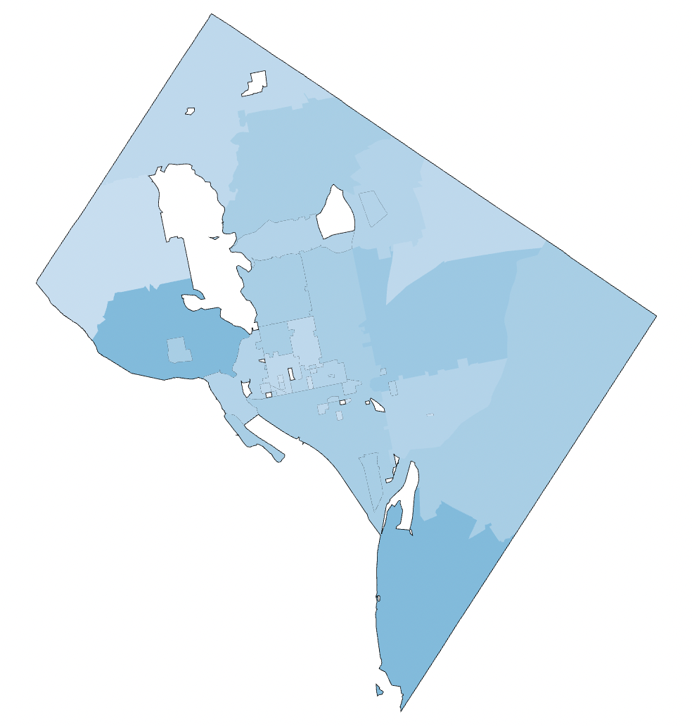
Query fields:
users.zipusers.user_count
{ "layer": [ { "data": { "url": "https://raw.githubusercontent.com/OpenDataDE/State-zip-code-GeoJSON/master/dc_district_of_columbia_zip_codes_geo.min.json", "format": { "property": "features" } }, "mark": { "fill": "white", "type": "geoshape", "stroke": "black" } }, { "mark": "geoshape", "width": "container", "height": "container", "encoding": { "color": { "type": "quantitative", "field": "users\\.count", "scale": { "domain": [ 0, 20 ], "scheme": "blues" }, "legend": null }, "shape": { "type": "geojson", "field": "geo" }, "tooltip": [ { "field": "users\\.zip" }, { "type": "quantitative", "field": "users\\.count", "title": "Users Count" } ] } } ], "transform": [ { "as": "geo", "from": { "key": "properties.ZCTA5CE10", "data": { "url": "https://raw.githubusercontent.com/OpenDataDE/State-zip-code-GeoJSON/master/dc_district_of_columbia_zip_codes_geo.min.json", "format": { "property": "features" } } }, "lookup": "users\\.zip" } ], "projection": { "type": "albersUsa" }}Radial chart
Section titled “Radial chart”A radial chart layers in exploding pie slices using the square root of the value.
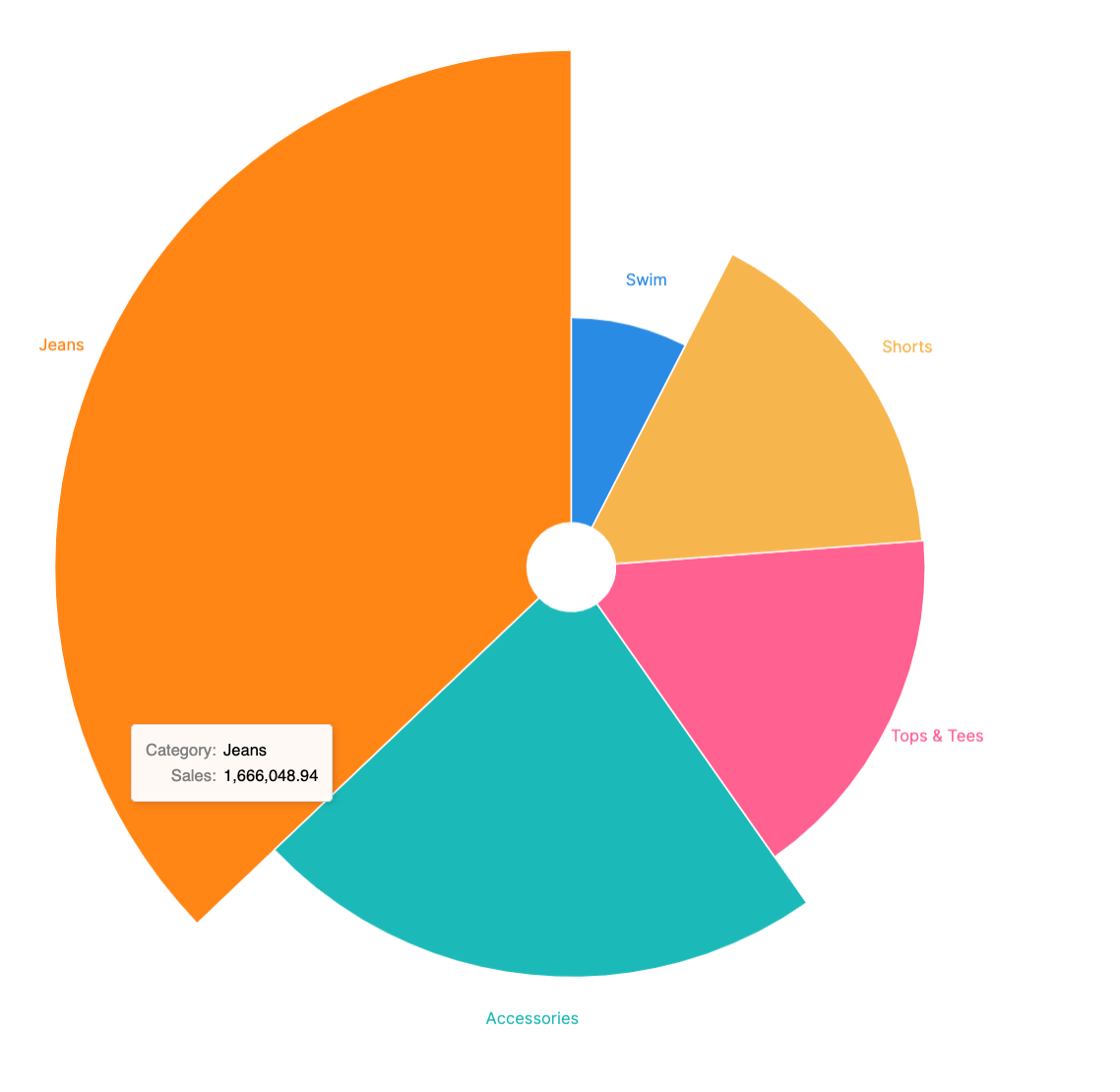
Query Fields:
products.categoryorder_items.sale_price_sum
{ "layer": [ { "mark": { "type": "arc", "stroke": "#fff", "innerRadius": 30 } }, { "mark": { "dx": 4, "type": "text", "align": "center", "radiusOffset": 30 }, "encoding": { "text": { "type": "nominal", "field": "COLOR" } } } ], "height": "container", "width": "container", "encoding": { "color": { "type": "nominal", "field": "SIZE", "legend": null }, "theta": { "type": "quantitative", "field": "SIZE", "stack": true }, "radius": { "field": "SIZE", "scale": { "type": "sqrt", "zero": true, "rangeMin": 20 } }, "tooltip": [ { "type": "nominal", "field": "COLOR", "title": "Category" }, { "type": "quantitative", "field": "SIZE", "title": "Sales", "format": ",.2f" } ] }, "transform": [ { "as": "COLOR", "calculate": "datum['products.category']" }, { "as": "SIZE", "calculate": "datum['order_items.sale_price_sum']" } ]}Cross-filtered chart pair
Section titled “Cross-filtered chart pair”This visualization aggregates the top visualization over the highlight selection. Two charts are built from the results table, stacked, and then wired together. Note: This visualization also uses pixel sizing, which isn’t ideal for use on dashboards where container should be used for sizing.
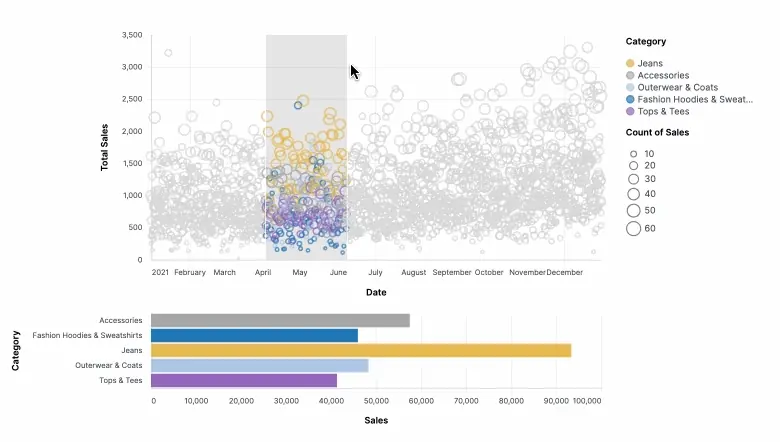
Query fields:
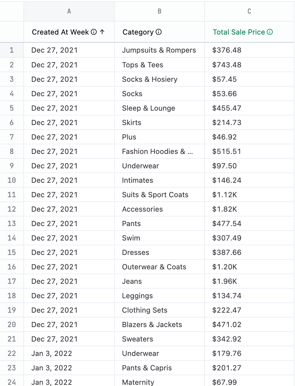
order_items.created_at[date]- Filtered to2021, the x-axisproducts.category- Filtered to five products, forming the color facetsorder_items.sale_price_sum- The y-axisorder_items.count- The bubble size
{ "vconcat": [ { "mark": "point", "width": 600, "height": 300, "params": [ { "name": "brush", "select": { "type": "interval", "encodings": [ "x" ] } } ], "encoding": { "x": { "type": "temporal", "field": "X_AXIS", "title": "Date" }, "y": { "type": "quantitative", "field": "TOP_Y", "title": "Total Sales" }, "size": { "type": "quantitative", "field": "BOTTOM_Y", "title": "Count of Sales" }, "color": { "value": "lightgray", "condition": { "type": "nominal", "field": "COLOR", "param": "brush", "title": "Category" } } }, "transform": [ { "as": "X_AXIS", "calculate": "datum['order_items.created_at[date]']" }, { "as": "TOP_Y", "calculate": "datum['order_items.sale_price_sum']" }, { "as": "BOTTOM_Y", "calculate": "datum['order_items.order_count']" }, { "as": "COLOR", "calculate": "datum['products.category']" }, { "filter": { "param": "click" } } ] }, { "mark": "bar", "width": 600, "params": [ { "name": "click", "select": { "type": "point", "encodings": [ "color" ] } } ], "encoding": { "x": { "field": "TOP_Y", "title": "Sales", "aggregate": "sum" }, "y": { "field": "COLOR", "title": "Category" }, "color": { "value": "lightgray", "condition": { "field": "COLOR", "param": "click" } } }, "transform": [ { "as": "X_AXIS", "calculate": "datum['order_items.created_at[date]']" }, { "as": "TOP_Y", "calculate": "datum['order_items.sale_price_sum']" }, { "as": "BOTTOM_Y", "calculate": "datum['order_items.order_count']" }, { "as": "COLOR", "calculate": "datum['products.category']" }, { "filter": { "param": "brush" } } ] } ]}Flag marks scatterplot
Section titled “Flag marks scatterplot”This chart uses data about each country’s economy and a flag emoji to create a scatterplot. The flag emoji is used as the mark to represent the country. This example also uses log-scale.
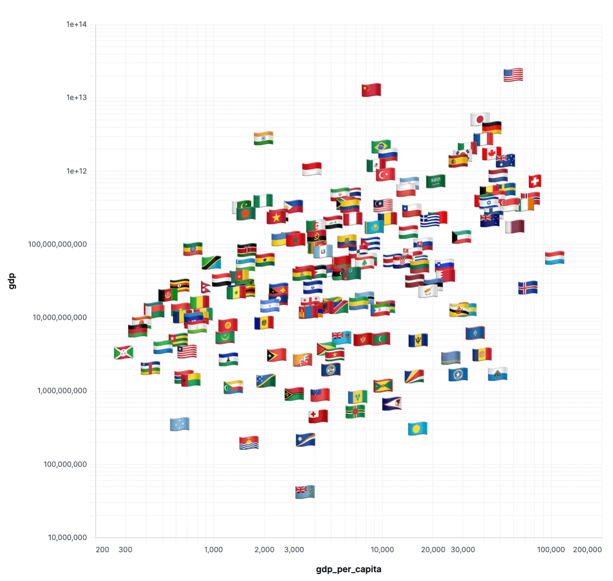
Query fields:
flag- Flag emojiname- Country namerankgdpgrowthpopulationgdp_per_capitagdp_percent_share
Example dataset:
{ "mark": { "type": "text", "fontSize": 30 }, "width": "container", "height": "container", "transform": [ { "as": "COUNTRY", "calculate": "datum['users.country']" }, { "as": "X_AXIS", "calculate": "datum['users.count']" }, { "as": "Y_AXIS", "calculate": "datum['order_items.sale_price_sum']" }, { "as": "ICON", "calculate": "datum['calc_1']" } ], "encoding": { "x": { "type": "quantitative", "field": "X_AXIS", "scale": { "type": "log" } }, "y": { "axis": { "labelOverlap": true }, "type": "quantitative", "field": "Y_AXIS", "scale": { "type": "log" } }, "text": { "type": "nominal", "field": "ICON" }, "tooltip": [ { "sort": null, "type": "nominal", "field": "ICON" }, { "sort": null, "type": "nominal", "field": "name", "title": "COUNTRY" }, { "sort": null, "type": "quantitative", "field": "X_AXIS" }, { "type": "quantitative", "field": "Y_AXIS" } ] }}Waterfall
Section titled “Waterfall”This waterfall chart requires both a custom visualization spec and some query munging. In this example, a change occurs state-by-state, at which point special bars are appended for the starting and ending values.
Note: The Vega spec contains a lot of calculation. This is intended to demonstrate the ability to extend the dataset to enhance the visualization.
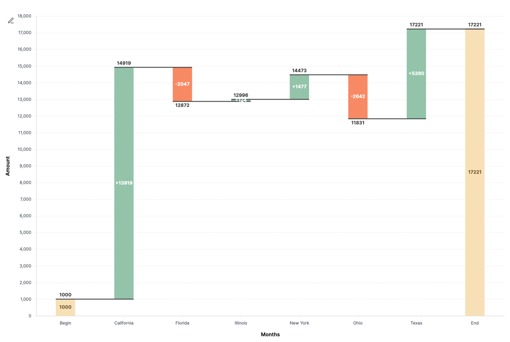
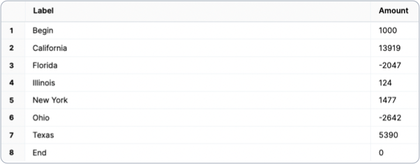
Query fields:
labelvalue
Unioned queries
Section titled “Unioned queries”The underlying data is brought together by using a SQL UNION clause.
( SELECT 'Begin' AS "label", 1000 AS "amount" FROM users LIMIT 1)UNION ALL( SELECT "users.state", "amount" FROM orders)UNION ALL( SELECT 'End', 0 FROM users LIMIT 1)- Begin row: Start value. Must be named
'Begin'for label; this can be replaced with the first value from the dataset in the future. - Waterfall data set: Build with the UI and drop in the SQL, or use the Advanced Editor to write SQL. When updating to your own query data, remember to reference data with the
view_name\\.field_namesyntax. - End row: Value must be
0. Must be named'End'; this can be replaced in the future since it’s all implied.
{ "layer": [ { "mark": { "size": 45, "type": "bar" }, "encoding": { "y": { "type": "quantitative", "field": "previous_sum", "title": "Amount" }, "y2": { "field": "sum" }, "color": { "value": "#93c4aa", "condition": [ { "test": "datum.LABEL === 'Begin' || datum.LABEL === 'End'", "value": "#f7e0b6" }, { "test": "datum.sum < datum.previous_sum", "value": "#f78a64" } ] } } }, { "mark": { "type": "rule", "color": "#404040", "opacity": 1, "xOffset": -22.5, "x2Offset": 22.5, "strokeWidth": 2 }, "encoding": { "y": { "type": "quantitative", "field": "sum" }, "x2": { "field": "lead" } } }, { "mark": { "dy": -4, "type": "text", "baseline": "bottom" }, "encoding": { "y": { "type": "quantitative", "field": "sum_inc" }, "text": { "type": "nominal", "field": "sum_inc", "format": "bigusdcurrency_2", "formatType": "omniNumberFormat" }, "opacity": { "condition": { "test": "datum['sum_inc'] == 0", "value": "0" } } } }, { "mark": { "dy": 4, "type": "text", "baseline": "top" }, "encoding": { "y": { "type": "quantitative", "field": "sum_dec" }, "text": { "type": "nominal", "field": "sum_dec", "format": "bigusdcurrency_2", "formatType": "omniNumberFormat" }, "opacity": { "condition": { "test": "datum['sum_dec'] == 0", "value": "0" } } } }, { "mark": { "type": "text", "baseline": "middle", "fontWeight": "bold" }, "encoding": { "y": { "type": "quantitative", "field": "center" }, "text": { "type": "nominal", "field": "AMOUNT", "format": "bigusdcurrency_2", "formatType": "omniNumberFormat" }, "color": { "value": "white", "condition": [ { "test": "datum.LABEL === 'Begin' || datum.LABEL === 'End'", "value": "#725a30" } ] }, "opacity": { "condition": { "test": "datum['amount_percent'] < 0.07", "value": "0" } } } } ], "width": "container", "config": { "text": { "color": "#404040", "fontWeight": "bold" } }, "height": "container", "encoding": { "x": { "axis": { "title": "Months", "labelAngle": 0 }, "sort": null, "type": "ordinal", "field": "LABEL" } }, "transform": [ { "as": "LABEL", "calculate": "datum['label']" }, { "as": "AMOUNT", "calculate": "datum['amount']" }, { "window": [ { "as": "sum", "op": "sum", "field": "AMOUNT" } ] }, { "window": [ { "as": "lead", "op": "lead", "field": "LABEL" } ] }, { "joinaggregate": [ { "as": "total", "op": "sum", "field": "AMOUNT" } ] }, { "as": "lead", "calculate": "datum.lead === null ? datum.LABEL : datum.lead" }, { "as": "previous_sum", "calculate": "datum.LABEL === 'End' ? 0 : datum.sum - datum.AMOUNT" }, { "as": "amount", "calculate": "datum.LABEL === 'End' ? datum.sum : datum.AMOUNT" }, { "as": "text_amount", "calculate": "(datum.LABEL !== 'Begin' && datum.LABEL !== 'End' && datum.AMOUNT > 0 ? '+' : '') + datum.AMOUNT" }, { "as": "amount_percent", "calculate": "abs(datum.AMOUNT) / datum.total" }, { "as": "center", "calculate": "(datum.sum + datum.previous_sum) / 2" }, { "as": "sum_dec", "calculate": "datum.sum < datum.previous_sum ? datum.sum : ''" }, { "as": "sum_inc", "calculate": "datum.sum > datum.previous_sum ? datum.sum : ''" } ]}Tapered funnel
Section titled “Tapered funnel”A tapered funnel is used to measure a funnel using several filtered measures. This chart calculates overall dropoff and step-by-step dropoff.
You can add or remove stages by editing the fold section and then the subsequent steps, removing the backticks: users\\.count then "measurename": "users.count".
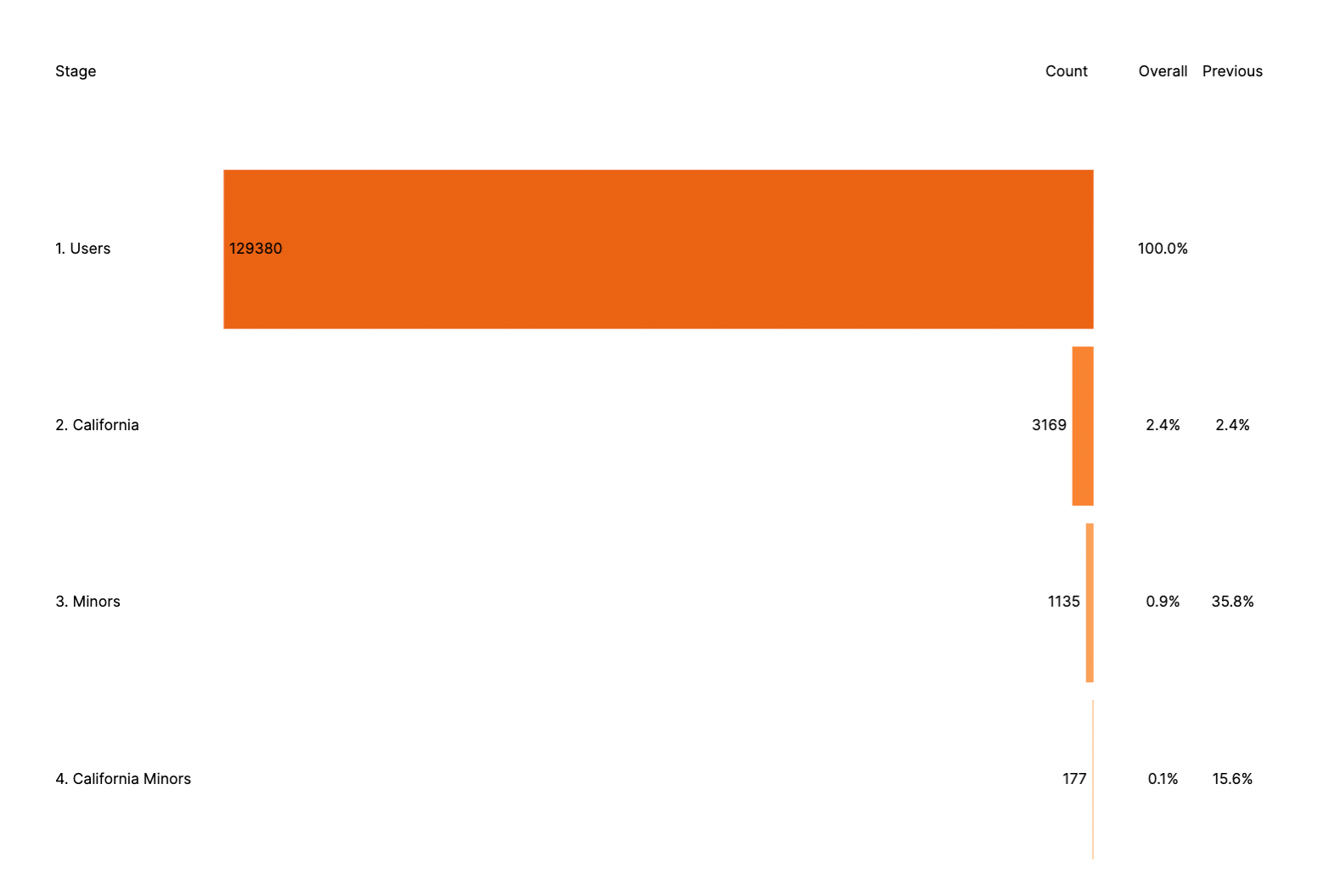
Query fields:
users.countusers.count_california_seniorsusers.count_minorsusers.count_california_minors
{ "layer": [ { "mark": { "type": "bar", "color": "transparent" }, "encoding": { "x": { "axis": "", "type": "quantitative", "field": "stagePos" } } }, { "mark": { "type": "bar", "tooltip": true }, "encoding": { "x": { "axis": "", "type": "quantitative", "field": "negCount" }, "color": { "field": "stage", "scale": { "scheme": { "name": "oranges", "extent": [ 0.8, 0 ] } }, "legend": null }, "tooltip": [ { "type": "nominal", "field": "stage", "title": "Stage" }, { "type": "quantitative", "field": "count", "title": "Count" } ] } }, { "mark": { "dx": { "expr": "datum.labelLeft ? -4 : 4" }, "type": "text", "align": { "expr": "datum.labelLeft ? 'right' : 'left'" } }, "encoding": { "x": { "axis": "", "type": "quantitative", "field": "negCount" }, "text": { "field": "count" } } }, { "mark": { "dx": 4, "type": "text", "align": "left" }, "encoding": { "x": { "axis": "", "type": "quantitative", "field": "stagePos" }, "text": { "field": "stage" } } }, { "mark": { "type": "text", "align": "center" }, "encoding": { "x": { "axis": "", "type": "quantitative", "field": "cumulativePos" }, "text": { "field": "cumulativePct", "format": ".1%" } } }, { "mark": { "type": "text", "align": "center" }, "encoding": { "x": { "axis": "", "type": "quantitative", "field": "conversionPos" }, "text": { "field": "conversionPct", "format": ".1%" } }, "transform": [ { "filter": "isValid(datum.previousCount)" } ] }, { "mark": { "dx": { "expr": "datum.dx" }, "type": "text", "align": { "expr": "datum.align" } }, "encoding": { "x": { "axis": "", "type": "quantitative", "field": "pos" }, "y": { "axis": null, "type": "nominal", "datum": "0. Titles" }, "text": { "field": "caption" } }, "transform": [ { "filter": "!isValid(datum.previousCount)" }, { "as": "zero", "calculate": "0" }, { "as": [ "column", "pos" ], "fold": [ "stagePos", "zero", "cumulativePos", "conversionPos" ] }, { "from": { "key": "column", "data": { "values": [ { "dx": 4, "align": "left", "column": "stagePos", "caption": "Stage" }, { "dx": -4, "align": "right", "column": "zero", "caption": "Count" }, { "dx": 0, "align": "center", "column": "cumulativePos", "caption": "Overall" }, { "dx": 0, "align": "center", "column": "conversionPos", "caption": "Previous" } ] }, "fields": [ "caption", "align", "dx" ] }, "lookup": "column" } ] } ], "width": "container", "height": "container", "encoding": { "y": { "axis": "", "type": "nominal", "field": "stage" } }, "transform": [ { "as": [ "measurename", "count" ], "fold": [ "users\\.count", "users\\.count_california_seniors", "users\\.count_minors", "users\\.count_california_minors" ] }, { "from": { "key": "measurename", "data": { "values": [ { "stage": "1. Users", "measurename": "users.count" }, { "stage": "2. California ", "measurename": "users.count_california_seniors" }, { "stage": "3. Minors", "measurename": "users.count_minors" }, { "stage": "4. California Minors", "measurename": "users.count_california_minors" } ] }, "fields": [ "stage" ] }, "lookup": "measurename" }, { "joinaggregate": [ { "as": "maxCount", "op": "max", "field": "count" } ] }, { "sort": [ { "field": "stage", "order": "ascending" } ], "window": [ { "as": "previousCount", "op": "lag", "field": "count" } ] }, { "as": "cumulativePct", "calculate": "datum.count / datum.maxCount" }, { "as": "conversionPct", "calculate": "datum.count / datum.previousCount" }, { "as": "countPos", "calculate": "datum.maxCount * 0.5" }, { "as": "cumulativePos", "calculate": "datum.maxCount * 0.08" }, { "as": "conversionPos", "calculate": "datum.maxCount * 0.16" }, { "as": "stagePos", "calculate": "datum.maxCount * -1.2" }, { "as": "negCount", "calculate": "-datum.count" }, { "as": "labelLeft", "calculate": "datum.count < 0.1 * datum.maxCount" } ]}Centered funnel
Section titled “Centered funnel”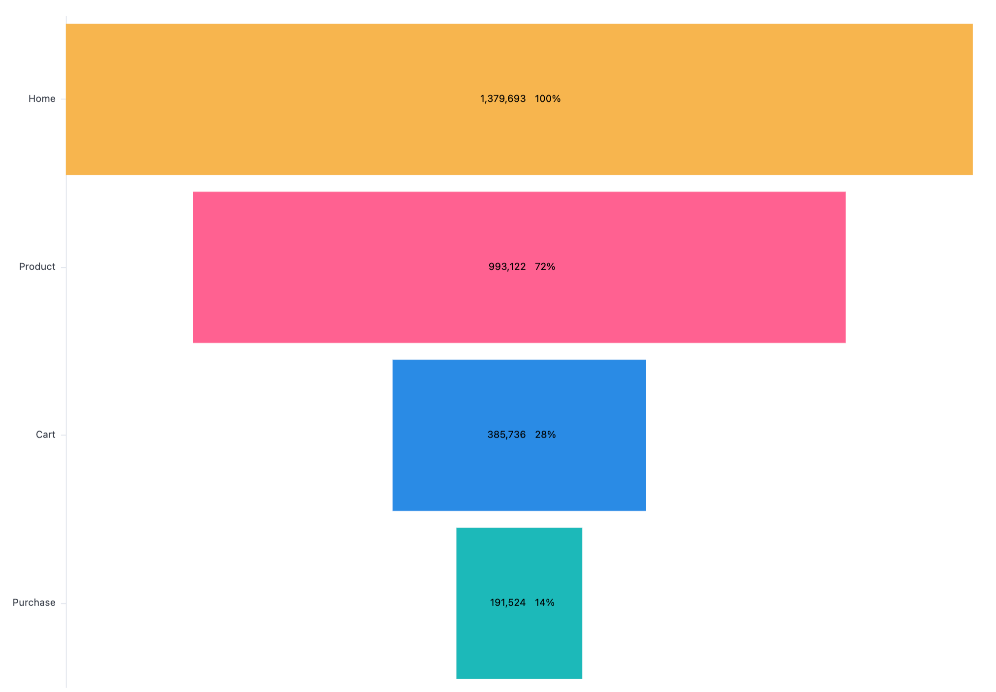
Funnel with currency
Section titled “Funnel with currency”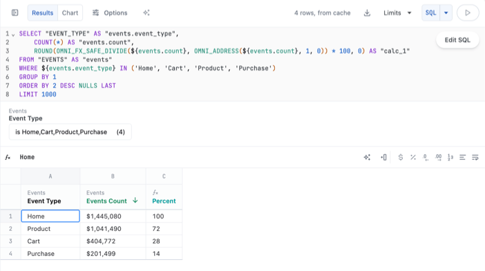
{ "layer": [ { "mark": "bar", "encoding": { "x": { "axis": false, "type": "quantitative", "field": "AMOUNT", "stack": "center" }, "color": { "type": "nominal", "field": "COLOR", "legend": null } } }, { "layer": [ { "mark": { "dx": 0, "type": "text", "align": "right" }, "encoding": { "text": { "type": "quantitative", "field": "AMOUNT", "format": "USDCURRENCY", "formatType": "omniNumberFormat" } } }, { "mark": { "dx": 10, "type": "text", "align": "left" }, "encoding": { "text": { "type": "quantitative", "field": "PERCENT", "format": "PERCENT", "formatType": "omniNumberFormat", "condition": { "test": "datum['PERCENT'] > 1", "value": "N/A" } } } } ] } ], "transform": [ { "as": "COLOR", "calculate": "datum['events.event_type']" }, { "as": "AMOUNT", "calculate": "datum['events.count']" }, { "window": [ { "field": "AMOUNT", "op": "lag", "as": "PREVIOUS_AMOUNT" } ] }, { "as": "PERCENT", "calculate": "datum.AMOUNT/datum.PREVIOUS_AMOUNT" } ], "width": "container", "height": "container", "encoding": { "y": { "axis": { "title": false }, "sort": null, "type": "nominal", "field": "events\\.event_type" } }}Funnel with a dimension and a measure
Section titled “Funnel with a dimension and a measure”
{ "layer": [ { "mark": "bar", "encoding": { "x": { "axis": false, "type": "quantitative", "field": "events\\.count", "stack": "center" }, "color": { "type": "nominal", "field": "events\\.event_type", "legend": null } } }, { "layer": [ { "mark": { "dx": 0, "type": "text", "align": "right" }, "encoding": { "text": { "type": "quantitative", "field": "events\\.count", "formatType": "omniNumberFormat" } } }, { "mark": { "dx": 10, "type": "text", "align": "left" }, "encoding": { "text": { "type": "nominal", "field": "phase" } }, "transform": [ { "as": "phase", "calculate": "datum.calc_1 + '%'" } ] } ] } ], "width": "container", "height": "container", "encoding": { "y": { "axis": { "title": false }, "sort": null, "type": "nominal", "field": "events\\.event_type" } }}Funnel with three measures
Section titled “Funnel with three measures”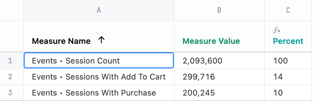
{ "layer": [ { "mark": "bar", "encoding": { "x": { "axis": false, "type": "quantitative", "field": "measure_value", "stack": "center" }, "color": { "type": "nominal", "field": "measure_name", "legend": null } } }, { "layer": [ { "mark": { "dx": 0, "type": "text", "align": "right" }, "encoding": { "text": { "type": "quantitative", "field": "measure_value", "formatType": "omniNumberFormat" } } }, { "mark": { "dx": 10, "type": "text", "align": "left" }, "encoding": { "text": { "type": "nominal", "field": "phase" } }, "transform": [ { "as": "phase", "calculate": "datum.calc_1 + '%'" } ] } ] } ], "width": "container", "height": "container", "encoding": { "y": { "axis": { "title": false }, "sort": null, "type": "nominal", "field": "measure_name" } }}Gantt (timeline) chart
Section titled “Gantt (timeline) chart”This chart takes advantage of x, x2 in Vega to create a start and end point for bars along a timeline for each user. It also includes config to improve the axis labels. Color could be included in an additional facet, using one more dimension to group different users together.
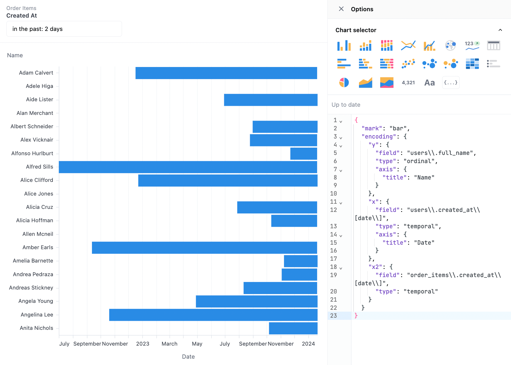
Query fields:
users.full_nameusers.created_at[date]order_items.created_at[date]
{ "mark": "bar", "encoding": { "y": { "field": "DIM", "type": "ordinal", "axis": { "title": "Name" } }, "x": { "field": "START", "type": "temporal", "axis": { "title": "Date" } }, "x2": { "field": "END", "type": "temporal" } }, "transform": [ { "as": "DIM", "calculate": "datum['users.full_name']" }, { "as": "START", "calculate": "datum['users.created_at[date]']" }, { "as": "END", "calculate": "datum['order_items.created_at[date]']" } ]}Isotope (stacked icons)
Section titled “Isotope (stacked icons)”Unlike other charts, this chart requires the full granularity in the dataset to create the stacked icons. The core technique is to map the repeated values into icons and then stack them. Note: In this example, users.id is included in order to create one entry per row.
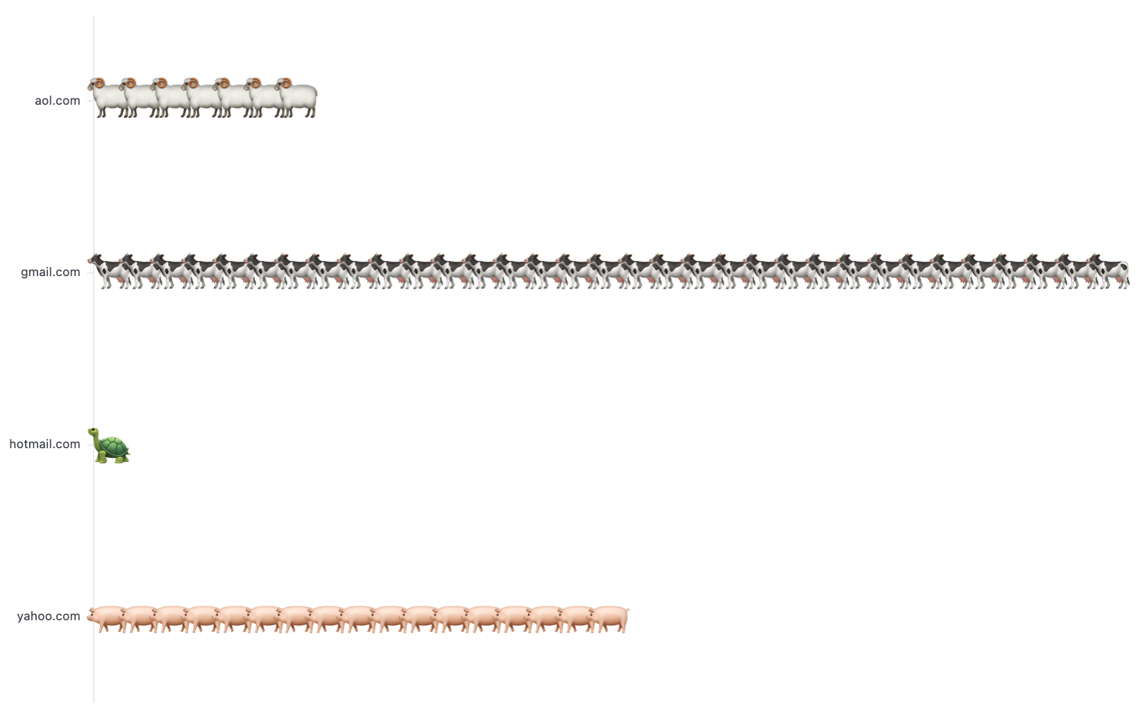
Query fields:
users.email_domainusers.id
{ "mark": { "type": "text", "baseline": "middle" }, "width": "container", "config": { "view": { "stroke": "" } }, "height": "container", "encoding": { "x": { "axis": null, "type": "ordinal", "field": "rank" }, "y": { "type": "nominal", "field": "DIM", "title": null }, "size": { "value": 40 }, "text": { "type": "nominal", "field": "emoji" } }, "transform": [ { "as": "DIM", "calculate": "datum['users\\.traffic_source']" }, { "as": "COUNTER", "calculate": "datum['users.id']" }, { "as": "emoji", "calculate": "{'Search': '\ud83d\udc04', 'Display': '\ud83d\udc0f', 'Organic': '\ud83d\udc16', 'Facebook': '\ud83d\udc22', 'Email': '\ud83d\udc22'}[datum.DIM]]" }, { "window": [ { "as": "rank", "op": "rank" } ], "groupby": [ "DIM" ] } ]}A gauge chart resembles a speedometer or dial and is typically used to display a single value within a predefined range. This visualization is useful for evaluating progress against a goal.
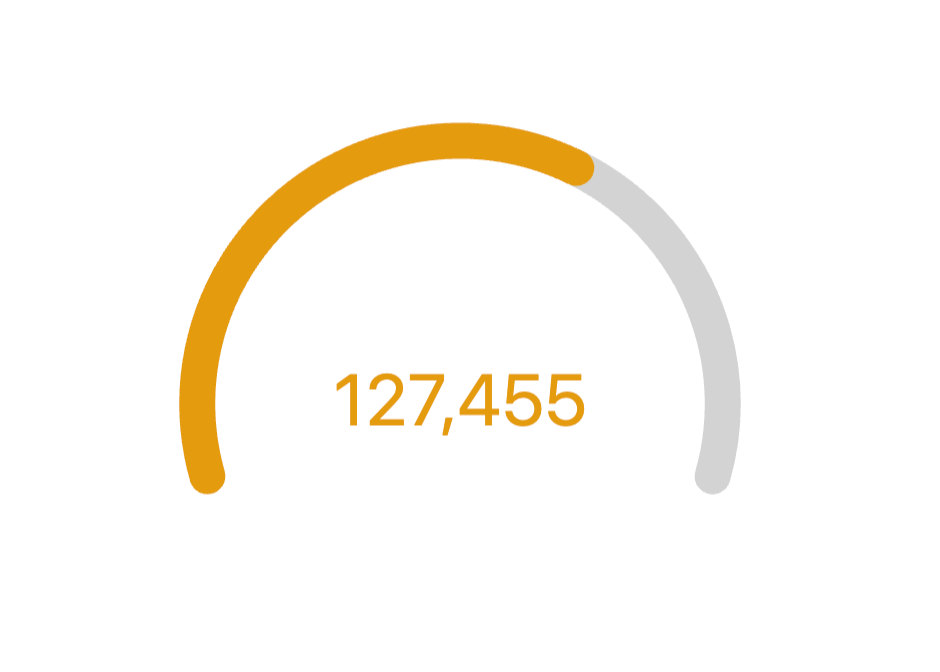
Example dataset:
{ "layer": [ { "mark": { "type": "arc", "color": "lightgrey", "theta": { "expr": "datum['_arc_start_radians']" }, "radius": { "expr": "ring1_outer" }, "theta2": { "expr": "datum['_arc_end_radians']" }, "radius2": { "expr": "ring1_inner" }, "cornerRadius": 10 } }, { "mark": { "type": "arc", "theta": { "expr": "datum['_ring_start_radians']" }, "radius": { "expr": "ring1_outer" }, "theta2": { "expr": "datum['_ring_end_radians']" }, "radius2": { "expr": "ring1_inner" }, "cornerRadius": 10 }, "name": "RING", "encoding": { "color": { "value": "#307E31", "condition": [ { "test": "datum['ratio'] < 0.33", "value": "#880808" }, { "test": "datum['ratio'] < 0.66", "value": "#E49B0F" } ] } } }, { "mark": { "type": "text", "fontSize": 40 }, "encoding": { "text": { "field": "users\\.count", "format": "number", "formatType": "omniNumberFormat" }, "color": { "value": "#307E31", "condition": [ { "test": "datum['ratio'] < 0.33", "value": "#880808" }, { "test": "datum['ratio'] < 0.66", "value": "#E49B0F" } ] } } } ], "width": "container", "config": { "concat": { "spacing": 0 }, "autosize": { "type": "fit", "resize": true, "contains": "padding" } }, "height": "container", "params": [ { "name": "ring_max", "value": 160 }, { "name": "ring_width", "value": 20 }, { "name": "ring_gap", "value": 5 }, { "name": "label_color", "value": "#000000" }, { "name": "ring_background_opacity", "value": 0.3 }, { "name": "ring0_percent", "value": 100 }, { "expr": "ring_max+2", "name": "ring0_outer" }, { "expr": "ring_max+1", "name": "ring0_inner" }, { "expr": "ring0_inner-ring_gap", "name": "ring1_outer" }, { "expr": "ring1_outer-ring_width", "name": "ring1_inner" }, { "expr": "(ring1_outer+ring1_inner)/2", "name": "ring1_middle" }, { "expr": "220", "name": "arc_size" } ], "transform": [ { "as": "ratio", "calculate": "datum['users\\.count'] / ( datum['calc_1'] )" }, { "as": "_arc_start_degrees", "calculate": "360 - ( arc_size / 2 )" }, { "as": "_arc_end_degrees", "calculate": "0 + ( arc_size / 2 )" }, { "as": "_arc_start_radians", "calculate": "2 * 3.14 * ( datum['_arc_start_degrees'] - 360 ) / 360" }, { "as": "_arc_end_radians", "calculate": "2 * 3.14 * datum['_arc_end_degrees'] / 360" }, { "as": "_arc_total_radians", "calculate": "datum['_arc_end_radians'] - datum['_arc_start_radians']" }, { "as": "_ring_start_radians", "calculate": "datum['_arc_start_radians']" }, { "as": "_ring_end_radians", "calculate": "datum['_arc_start_radians'] + ( datum['_arc_total_radians'] * datum['ratio'] )" } ]}Sunburst chart
Section titled “Sunburst chart”Sunburst charts display hierarchical data in an easy-to-read way. Each ring represents a level in the hierarchy, and the size of each section conveys its proportion in comparison to the whole.
In this example, the inner slices are colored by order.
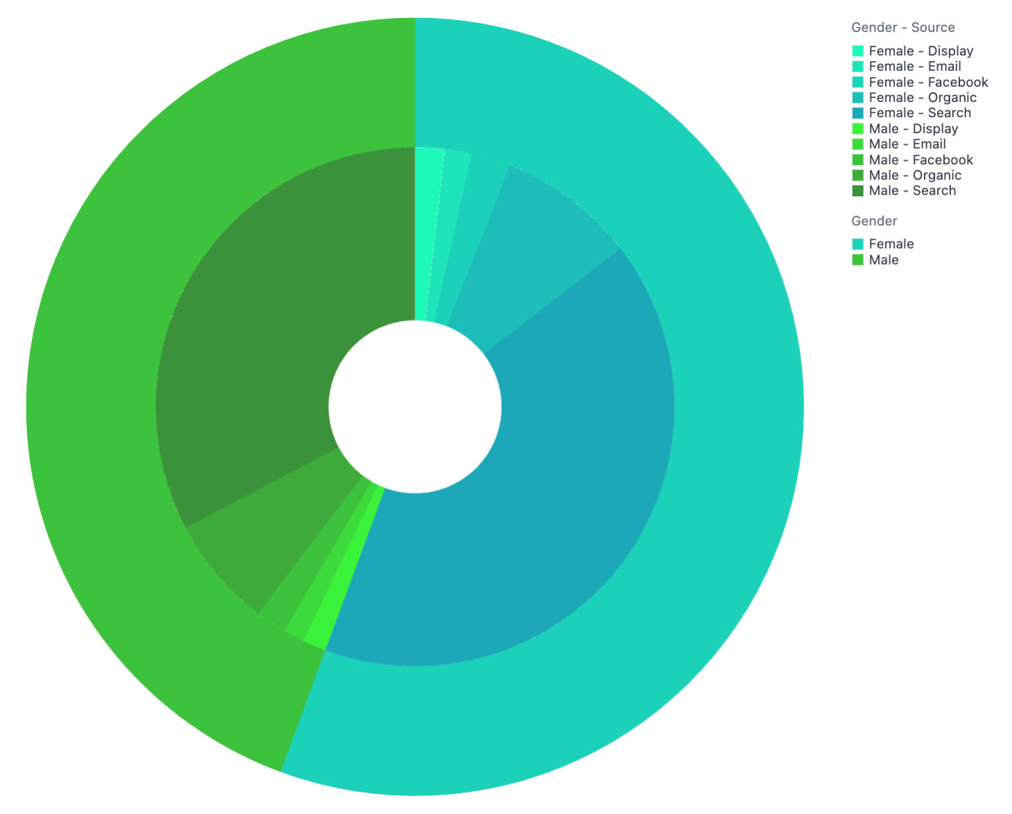
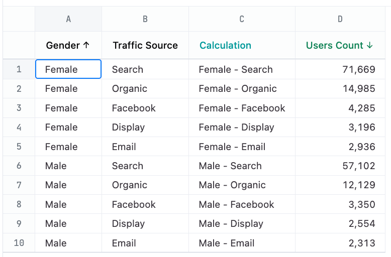
Query fields:
users.genderusers.traffic_sourceusers.count
Example dataset:
{ "layer": [ { "mark": { "type": "arc", "tooltip": true, "innerRadius": { "expr": "min(width, height)/9" }, "outerRadius": { "expr": "min(width, height)/3" } }, "encoding": { "color": { "sort": "ascending", "type": "ordinal", "field": "OUT_IN", "scale": { "range": [ "#1DF9B9", "#1DE5B9", "#1DD1B9", "#1DBDB9", "#1DA9B9", "#3DF23B", "#3DDA3B", "#3DC23B", "#3DAA3B", "#3D923B" ] }, "title": "Inner Grouping" }, "order": { "sort": "ascending", "field": "OUT_IN" }, "theta": { "type": "quantitative", "field": "SIZE", "stack": true }, "tooltip": [ { "type": "nominal", "field": "OUTSIDE", "title": [ "Outer Grouping" ] }, { "type": "nominal", "field": "INSIDE", "title": [ "Inner Grouping" ] }, { "type": "quantitative", "field": "SIZE", "title": [ "Count" ], "format": "NUMBER", "formatType": "omniNumberFormat" } ] } }, { "mark": { "type": "arc", "tooltip": true, "innerRadius": { "expr": "min(width, height)/3" } }, "encoding": { "color": { "sort": "ascending", "type": "ordinal", "field": "OUTSIDE", "scale": { "range": [ "#1DD1B9", "#3DC23B" ] }, "title": "Outer Grouping" }, "order": { "sort": "ascending", "field": "OUTSIDE" }, "theta": { "sort": "ascending", "type": "quantitative", "field": "total_users", "stack": true, "title": [ "Users Count" ] }, "tooltip": [ { "type": "nominal", "field": "OUTSIDE", "title": [ "Outer Grouping" ] }, { "type": "quantitative", "field": "total_users", "title": [ "Count" ], "format": "NUMBER", "formatType": "omniNumberFormat" } ] }, "transform": [ { "groupby": [ "OUTSIDE" ], "aggregate": [ { "as": "total_users", "op": "sum", "field": "SIZE" } ] } ] } ], "transform": [ { "as": "OUTSIDE", "calculate": "datum['users.gender']" }, { "as": "INSIDE", "calculate": "datum['users.traffic_source']" }, { "as": "OUT_IN", "calculate": "datum.OUTSIDE + '-' + datum.INSIDE" }, { "as": "SIZE", "calculate": "datum['users.count']" } ], "resolve": { "scale": { "color": "independent" }, "legend": { "color": "independent" } }}Trellis / Small Multiples / Faceted Charts
Section titled “Trellis / Small Multiples / Faceted Charts”Trellis charts allow you to show a grid of smaller charts, one for each category.
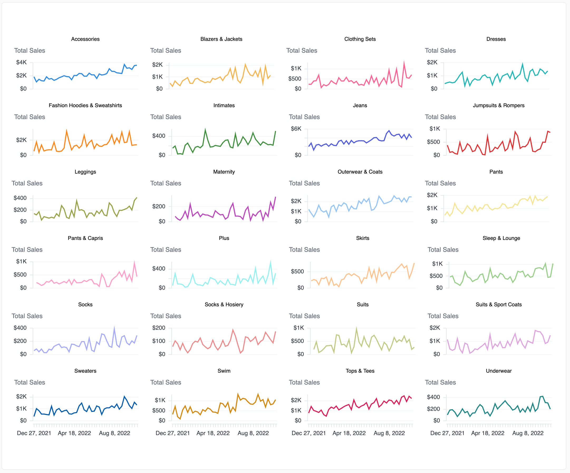
To use this example, update the following values in the custom visualization code:
DIMto be the x-axis value in your queryAMOUNTas the y-axis value in your queryFACETto be the grouping fieldCOLORfor the mark color
You can also adjust the mark type, the width and height of each small chart, and the number of columns to draw.
Example result set:
{ "mark": { "type": "line", "tooltip": true }, "width": 200, "height": 50, "resolve": { "scale": { "x": "shared", "y": "independent" } }, "encoding": { "x": { "axis": { "title": null, "format": "%b %-d, %Y", "formatType": "omniTimestampFormat", "labelOverlap": true }, "sort": "ascending", "type": "ordinal", "field": "DIM", "title": "Date", "timeUnit": "utcyearmonthdate" }, "y": { "axis": { "format": "bigusdcurrency_0", "orient": "left", "formatType": "omniNumberFormat", "labelOverlap": true }, "type": "quantitative", "field": "AMOUNT", "title": "Total Sales", "format": "bigusdcurrency_2", "formatType": "omniNumberFormat" }, "color": { "field": "COLOR", "title": "Category", "legend": null }, "facet": { "sort": "ascending", "type": "ordinal", "field": "FACET", "title": null, "columns": 4 } }, "transform": [ { "as": "DIM", "calculate": "datum['omni_dbt_ecomm__order_items.created_at[week]']" }, { "as": "AMOUNT", "calculate": "datum['omni_dbt_ecomm__order_items.total_sale_price']" }, { "as": "FACET", "calculate": "datum['omni_dbt_ecomm__products.category']" }, { "as": "COLOR", "calculate": "datum['omni_dbt_ecomm__products.category']" } ]}Word cloud
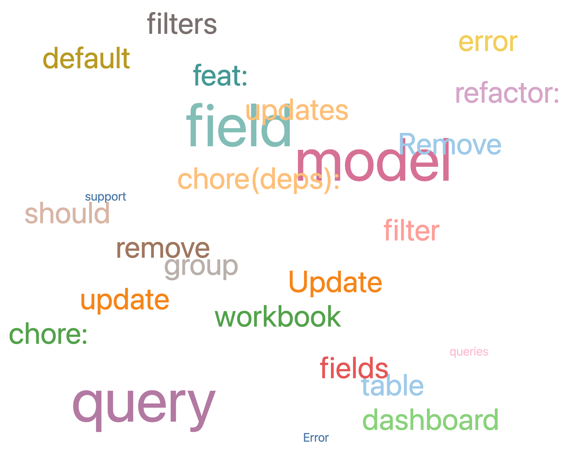
Section titled “Word cloud”Word clouds are an eye-catching way to visualize text data by showing the most common words in a dataset. The more frequently a word appears, the bigger and bolder it is, which makes it easy to spot key themes at a glance.
To use this example, change the following values in the custom visualization code:
fieldvalues should match the values in the table- Adjust the
rangeto fit your query - Adjust the
domainto fit your query
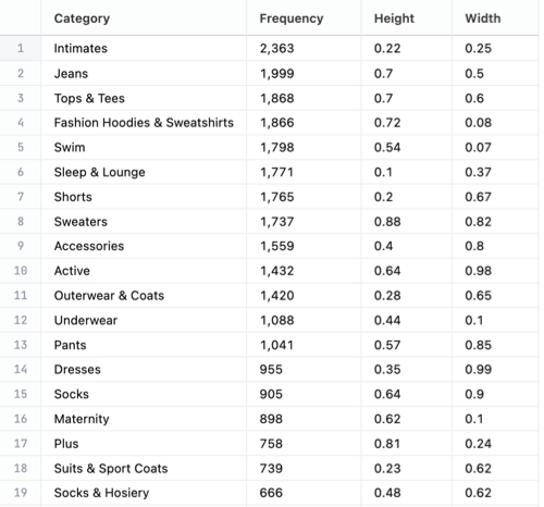
SELECT category, COUNT(*) AS frequency, RANDOM() * (0.9 - 0.1) + 0.1 AS height, RANDOM() AS widthFROM productsGROUP BY 1ORDER BY 2 DESCLIMIT 25;Example dataset:
{ "mark": "text", "width": "container", "height": "container", "transform": [ { "as": "DIM", "calculate": "datum['category']" }, { "as": "SIZE", "calculate": "datum['frequency']" }, { "as": "COLOR", "calculate": "datum['department']" }, { "as": "X", "calculate": "random() * (0.9 - 0.1) + 0.1" }, { "as": "Y", "calculate": "random()" } ], "encoding": { "x": { "axis": null, "field": "X" }, "y": { "axis": null, "field": "Y" }, "size": { "field": "SIZE", "legend": null }, "text": { "field": "DIM" }, "color": { "field": "COLOR", "scale": { "scheme": "tableau20" }, "legend": null } }}Scatter Plot with Color Quadrants
Section titled “Scatter Plot with Color Quadrants”Being able to show a scatter plot of values in and showing where they land within specific designated quadrants and above certain thresholds with the easy deliantion of different colors, makes it easily to see where each value lands at a glance.
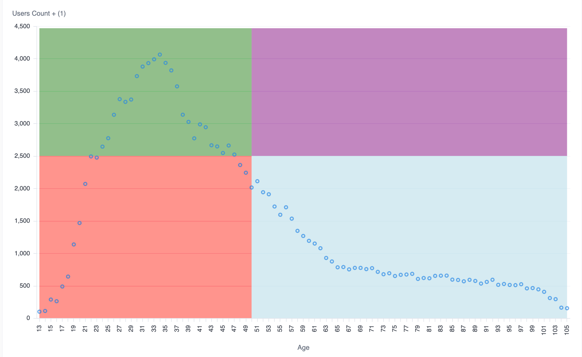
To use this example, change the following values in the custom visualization code:
calc_1calc_2calc_3calc_4set the values for your four quadrants, these can also be hard-coded or referenced from calculated fields as noted in the example- Adjust the
users.ageto fit your query - Adjust the
users.countto fit your query
SELECT users.age, users.count, calc_1, calc_2, calc_3, calc_4FROM usersExample dataset:
{ "layer": [ { "layer": [ { "mark": { "line": false, "type": "area", "tooltip": false }, "encoding": { "y": { "type": "quantitative", "field": "calc_2" }, "color": { "value": "red" } } }, { "mark": { "line": false, "type": "area", "tooltip": false }, "encoding": { "y": { "type": "quantitative", "field": "calc_3" }, "color": { "value": "lightblue" } } }, { "mark": { "line": false, "type": "area", "tooltip": false }, "encoding": { "y": { "type": "quantitative", "field": "calc_1" }, "y2": { "type": "quantitative", "field": "calc_2" }, "color": { "value": "green" } } }, { "mark": { "line": false, "type": "area", "tooltip": false }, "encoding": { "y": { "type": "quantitative", "field": "calc_4" }, "y2": { "type": "quantitative", "field": "calc_3" }, "color": { "value": "purple" } } }, { "mark": { "type": "point", "tooltip": true }, "encoding": { "y": { "axis": { "title": "Users Count + (1)", "format": "NUMBER_0", "orient": "left", "formatType": "omniNumberFormat", "labelOverlap": true }, "type": "quantitative", "field": "users\\.count", "title": "Users Count" }, "color": { "datum": "Users Count" }, "tooltip": [ { "type": "quantitative", "field": "users\\.age", "title": "Age" }, { "type": "quantitative", "field": "users\\.count", "title": "Users Count", "format": "NUMBER_0", "formatType": "omniNumberFormat" }, { "type": "quantitative", "field": "users\\.age_max", "title": "Age Max" } ] } } ] }, { "mark": { "type": "rule", "tooltip": true, "strokeDash": [ 4, 2 ] }, "params": [ { "name": "hover", "select": { "on": "mouseover", "type": "point", "clear": "mouseout", "nearest": true } } ], "encoding": { "opacity": { "value": 0, "condition": { "test": { "empty": false, "param": "hover" }, "value": 1 } }, "tooltip": [ { "type": "quantitative", "field": "users\\.age", "title": "Age" }, { "type": "quantitative", "field": "users\\.count", "title": "Users Count", "format": "NUMBER_0", "formatType": "omniNumberFormat" } ] } } ], "width": "container", "height": "container", "encoding": { "x": { "axis": { "title": "Age", "labelOverlap": true }, "sort": "ascending", "type": "ordinal", "field": "users\\.age", "title": "Age" }, "color": { "scale": { "domain": [ "Users Count", "Age Max" ], "scheme": "omni" }, "legend": null } }}Bullet charts
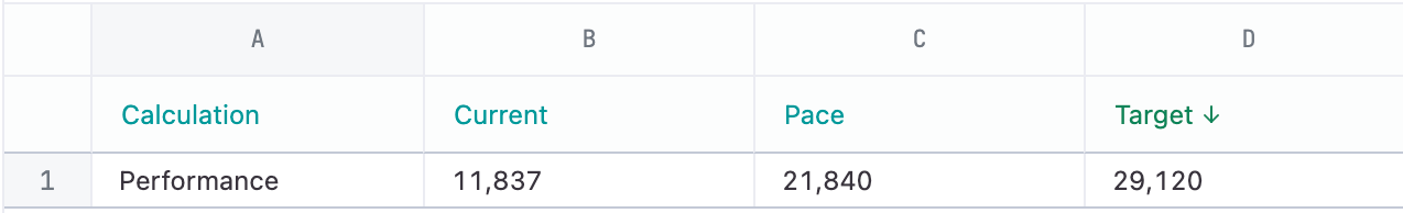
Section titled “Bullet charts”Bullet charts are used to track a metric against a target. A bar is used to measure the actual value of the metric, a vertical line or marker for the target, and background bands for adding qualitative ranges.
Single bullet chart
Section titled “Single bullet chart”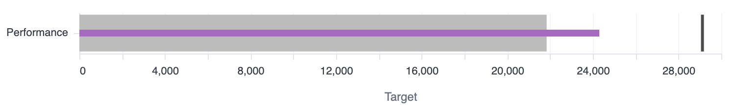
Example dataset
{ "layer": [ { "mark": "bar", "params": [ { "bind": "legend", "name": "omni_click", "select": { "type": "point", "fields": [ "omni__measure_name" ] } } ], "encoding": { "color": { "field": "omni__measure_name" }, "opacity": { "value": 0 } } }, { "layer": [ { "layer": [ { "mark": { "type": "bar", "tooltip": true }, "encoding": { "color": { "field": "omni__measure_name", "legend": null } }, "transform": [ { "filter": { "field": "omni__measure_name", "oneOf": [ "Pace" ] } } ] }, { "mark": { "type": "bar", "height": 7, "tooltip": true }, "encoding": { "color": { "field": "omni__measure_name", "legend": null } }, "transform": [ { "filter": { "field": "omni__measure_name", "oneOf": [ "Current" ] } } ] }, { "mark": { "type": "tick", "tooltip": true, "thickness": 3 }, "encoding": { "color": { "field": "omni__measure_name", "legend": null } }, "transform": [ { "filter": { "field": "omni__measure_name", "oneOf": [ "Target" ] } } ] } ], "encoding": { "x": { "axis": { "title": "Target", "format": "NUMBER_0", "orient": "bottom", "formatType": "omniNumberFormat", "labelOverlap": true }, "type": "quantitative", "field": "omni__measure_value", "stack": null, "title": "Target + (2)" }, "color": { "scale": { "range": [ "#000000ff", "#bcbcbcff", "#A66BBF" ], "domain": [ "Target", "Pace", "Current" ] } }, "order": { "sort": "descending", "type": "quantitative", "field": "omni__key_order" } }, "transform": [ { "filter": { "field": "omni__measure_name", "oneOf": [ "Target", "Pace", "Current" ] } } ] } ], "encoding": { "y": { "axis": { "title": null, "labelOverlap": true }, "type": "ordinal", "field": "CATEGORICAL", "title": [ "Category" ] }, "tooltip": [ { "type": "nominal", "field": "CATEGORICAL", "title": [ "Category" ] }, { "type": "quantitative", "field": "CURRENT", "title": [ "Current" ], "format": "NUMBER_0", "formatType": "omniNumberFormat" }, { "type": "quantitative", "field": "PACE", "title": [ "Pace" ], "format": "NUMBER_0", "formatType": "omniNumberFormat" }, { "type": "quantitative", "field": "TARGET", "title": [ "Target" ], "format": "NUMBER_0", "formatType": "omniNumberFormat" } ] }, "transform": [ { "as": [ "omni__measure_name", "omni__measure_value" ], "fold": [ "TARGET", "PACE", "CURRENT" ] }, { "as": "omni__measure_name", "calculate": "{\"TARGET\":\"Target\",\"PACE\":\"Pace\",\"CURRENT\":\"Current\"}[datum.omni__measure_name]" }, { "as": "omni__key_order", "calculate": "indexof([\"Target\",\"Pace\",\"Current\"], datum.omni__measure_name)" }, { "filter": { "param": "omni_click" } } ] } ], "width": "container", "height": "container", "$schema": "https://vega.github.io/schema/vega-lite/v5.json", "transform": [ { "as": "TARGET", "calculate": "datum['products.count']" }, { "as": "PACE", "calculate": "datum['calc_2']" }, { "as": "CURRENT", "calculate": "datum['calc_1']" }, { "as": "CATEGORICAL", "calculate": "datum['calc_3']" } ]}Multiple categories
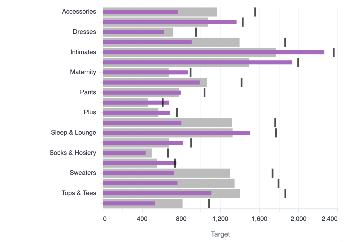
Section titled “Multiple categories”Same as the single bullet, just repeated across the categories.
Example dataset
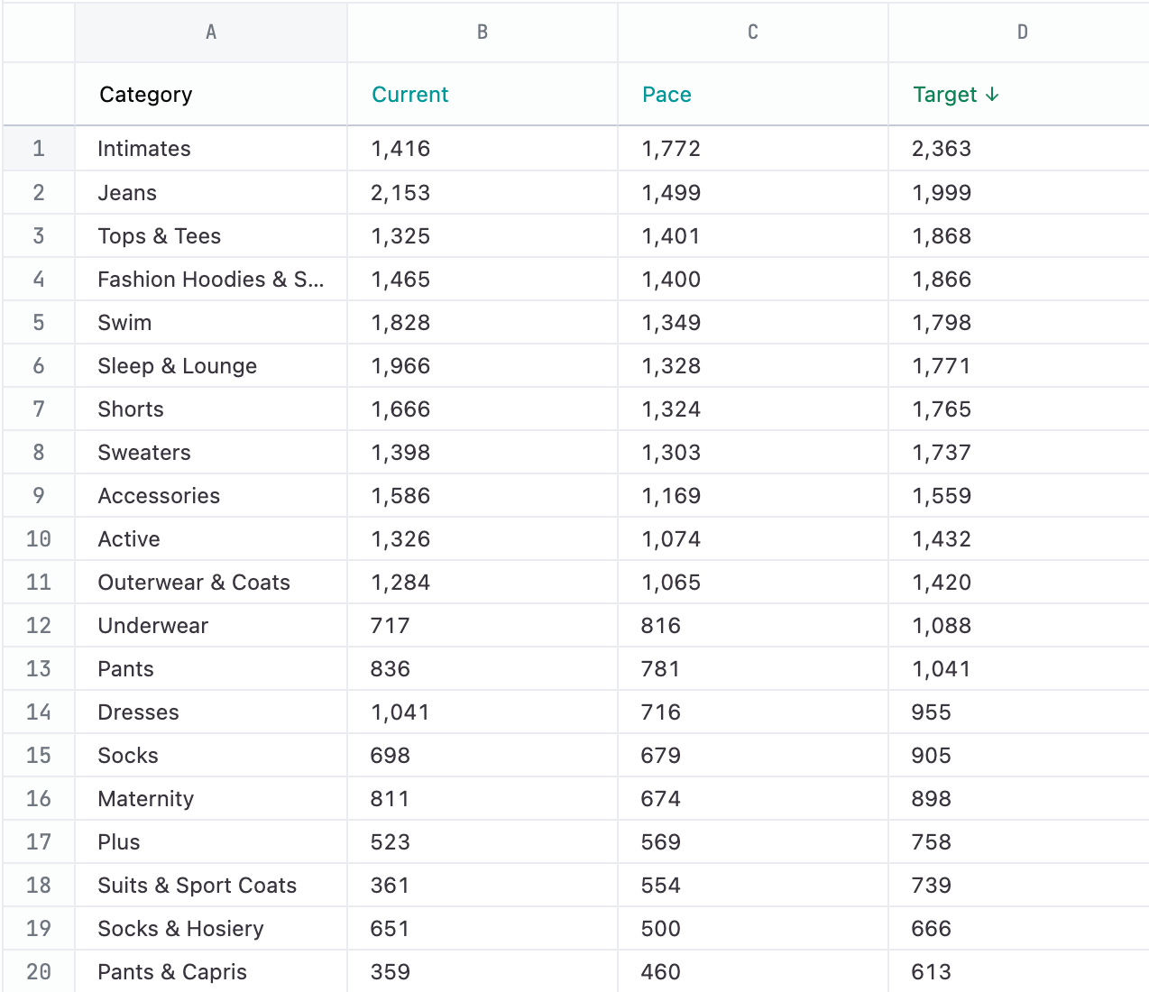
{ "layer": [ { "mark": "bar", "params": [ { "bind": "legend", "name": "omni_click", "select": { "type": "point", "fields": [ "omni__measure_name" ] } } ], "encoding": { "color": { "field": "omni__measure_name" }, "opacity": { "value": 0 } } }, { "layer": [ { "layer": [ { "mark": { "type": "bar", "tooltip": true }, "encoding": { "color": { "field": "omni__measure_name", "legend": null } }, "transform": [ { "filter": { "field": "omni__measure_name", "oneOf": [ "Pace" ] } } ] }, { "mark": { "type": "bar", "height": 7, "tooltip": true }, "encoding": { "color": { "field": "omni__measure_name", "legend": null } }, "transform": [ { "filter": { "field": "omni__measure_name", "oneOf": [ "Current" ] } } ] }, { "mark": { "type": "tick", "tooltip": true, "thickness": 3 }, "encoding": { "color": { "field": "omni__measure_name", "legend": null } }, "transform": [ { "filter": { "field": "omni__measure_name", "oneOf": [ "Target" ] } } ] } ], "encoding": { "x": { "axis": { "title": "Target", "format": "NUMBER_0", "orient": "bottom", "formatType": "omniNumberFormat", "labelOverlap": true }, "type": "quantitative", "field": "omni__measure_value", "stack": null, "title": "Target + (2)" }, "color": { "scale": { "range": [ "#000000ff", "#bcbcbcff", "#A66BBF" ], "domain": [ "Target", "Pace", "Current" ] } }, "order": { "sort": "descending", "type": "quantitative", "field": "omni__key_order" } }, "transform": [ { "filter": { "field": "omni__measure_name", "oneOf": [ "Target", "Pace", "Current" ] } } ] } ], "encoding": { "y": { "axis": { "title": null, "labelOverlap": true }, "type": "ordinal", "field": "CATEGORICAL", "title": [ "Category" ] }, "tooltip": [ { "type": "nominal", "field": "CATEGORICAL", "title": [ "Category" ] }, { "type": "quantitative", "field": "CURRENT", "title": [ "Current" ], "format": "NUMBER_0", "formatType": "omniNumberFormat" }, { "type": "quantitative", "field": "PACE", "title": [ "Pace" ], "format": "NUMBER_0", "formatType": "omniNumberFormat" }, { "type": "quantitative", "field": "TARGET", "title": [ "Target" ], "format": "NUMBER_0", "formatType": "omniNumberFormat" } ] }, "transform": [ { "as": [ "omni__measure_name", "omni__measure_value" ], "fold": [ "TARGET", "PACE", "CURRENT" ] }, { "as": "omni__measure_name", "calculate": "{\"TARGET\":\"Target\",\"PACE\":\"Pace\",\"CURRENT\":\"Current\"}[datum.omni__measure_name]" }, { "as": "omni__key_order", "calculate": "indexof([\"Target\",\"Pace\",\"Current\"], datum.omni__measure_name)" }, { "filter": { "param": "omni_click" } } ] } ], "width": "container", "height": "container", "$schema": "https://vega.github.io/schema/vega-lite/v5.json", "transform": [ { "as": "TARGET", "calculate": "datum['products.count']" }, { "as": "PACE", "calculate": "datum['calc_2']" }, { "as": "CURRENT", "calculate": "datum['calc_1']" }, { "as": "CATEGORICAL", "calculate": "datum['products.category']" } ]}Multiple categories with conditional coloring
Section titled “Multiple categories with conditional coloring”Using the same result set as the multiple categories, the bars are colored by whether they are above or below the pacing.
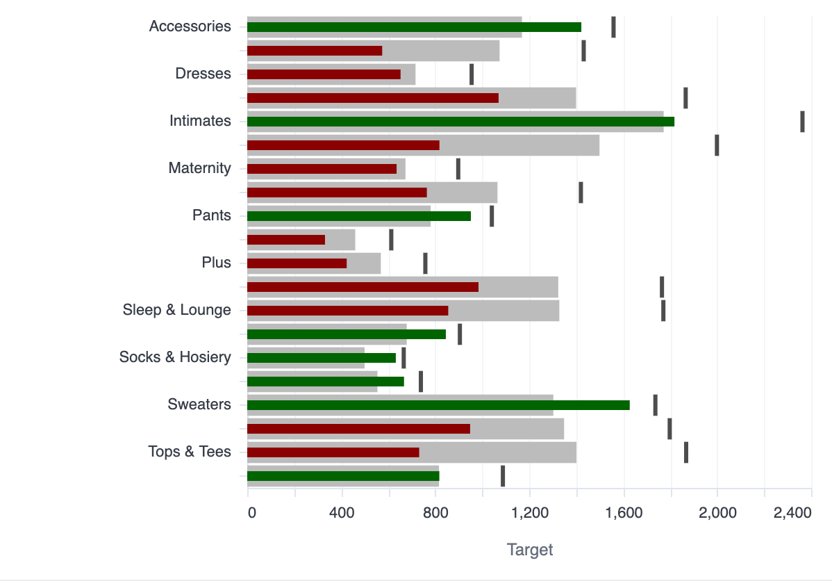
Example dataset
{ "layer": [ { "mark": "bar", "params": [ { "bind": "legend", "name": "omni_click", "select": { "type": "point", "fields": [ "omni__measure_name" ] } } ], "encoding": { "color": { "field": "omni__measure_name" }, "opacity": { "value": 0 } } }, { "layer": [ { "layer": [ { "mark": { "type": "bar", "tooltip": true }, "encoding": { "color": { "field": "omni__measure_name", "legend": null } }, "transform": [ { "filter": { "field": "omni__measure_name", "oneOf": [ "Pace" ] } } ] }, { "mark": { "type": "bar", "height": 7 }, "encoding": { "color": { "value": "darkred", "condition": { "test": "datum.ON_PACE == true", "value": "darkgreen" } } }, "transform": [ { "filter": { "field": "omni__measure_name", "oneOf": [ "Current" ] } } ] }, { "mark": { "type": "tick", "tooltip": true, "thickness": 3 }, "encoding": { "color": { "field": "omni__measure_name", "legend": null } }, "transform": [ { "filter": { "field": "omni__measure_name", "oneOf": [ "Target" ] } } ] } ], "encoding": { "x": { "axis": { "title": "Target", "format": "NUMBER_0", "orient": "bottom", "formatType": "omniNumberFormat", "labelOverlap": true }, "type": "quantitative", "field": "omni__measure_value", "stack": null, "title": "Target + (2)" }, "color": { "scale": { "range": [ "#000000ff", "#bcbcbcff", "#A66BBF", "#b50000ff" ], "domain": [ "Target", "Pace", "Current", "On Pace" ] } }, "order": { "sort": "descending", "type": "quantitative", "field": "omni__key_order" } }, "transform": [ { "filter": { "field": "omni__measure_name", "oneOf": [ "Target", "Pace", "Current" ] } } ] } ], "encoding": { "y": { "axis": { "title": null, "labelOverlap": true }, "type": "ordinal", "field": "CATEGORICAL", "title": [ "Category" ] }, "tooltip": [ { "type": "nominal", "field": "CATEGORICAL", "title": [ "Category" ] }, { "type": "quantitative", "field": "CURRENT", "title": [ "Current" ], "format": "NUMBER_0", "formatType": "omniNumberFormat" }, { "type": "quantitative", "field": "PACE", "title": [ "Pace" ], "format": "NUMBER_0", "formatType": "omniNumberFormat" }, { "type": "quantitative", "field": "TARGET", "title": [ "Target" ], "format": "NUMBER_0", "formatType": "omniNumberFormat" }, { "field": "ON_PACE" } ] }, "transform": [ { "as": [ "omni__measure_name", "omni__measure_value" ], "fold": [ "TARGET", "PACE", "CURRENT", "ON_PACE" ] }, { "as": "omni__measure_name", "calculate": "{\"TARGET\":\"Target\",\"PACE\":\"Pace\",\"CURRENT\":\"Current\",\"ON_PACE\":\"On Pace\"}[datum.omni__measure_name]" }, { "as": "omni__key_order", "calculate": "indexof([\"Target\",\"Pace\",\"Current\",\"On Pace\"], datum.omni__measure_name)" }, { "filter": { "param": "omni_click" } } ] } ], "width": "container", "height": "container", "$schema": "https://vega.github.io/schema/vega-lite/v5.json", "transform": [ { "as": "TARGET", "calculate": "datum['products.count']" }, { "as": "PACE", "calculate": "datum['calc_2']" }, { "as": "CURRENT", "calculate": "datum['calc_1']" }, { "as": "CATEGORICAL", "calculate": "datum['products.category']" }, { "as": "ON_PACE", "calculate": "datum.CURRENT > datum.PACE" } ]}Bullet chart inside a table
Section titled “Bullet chart inside a table”Additional detail per column, row banding, conditional coloring and sizing. Fancy!
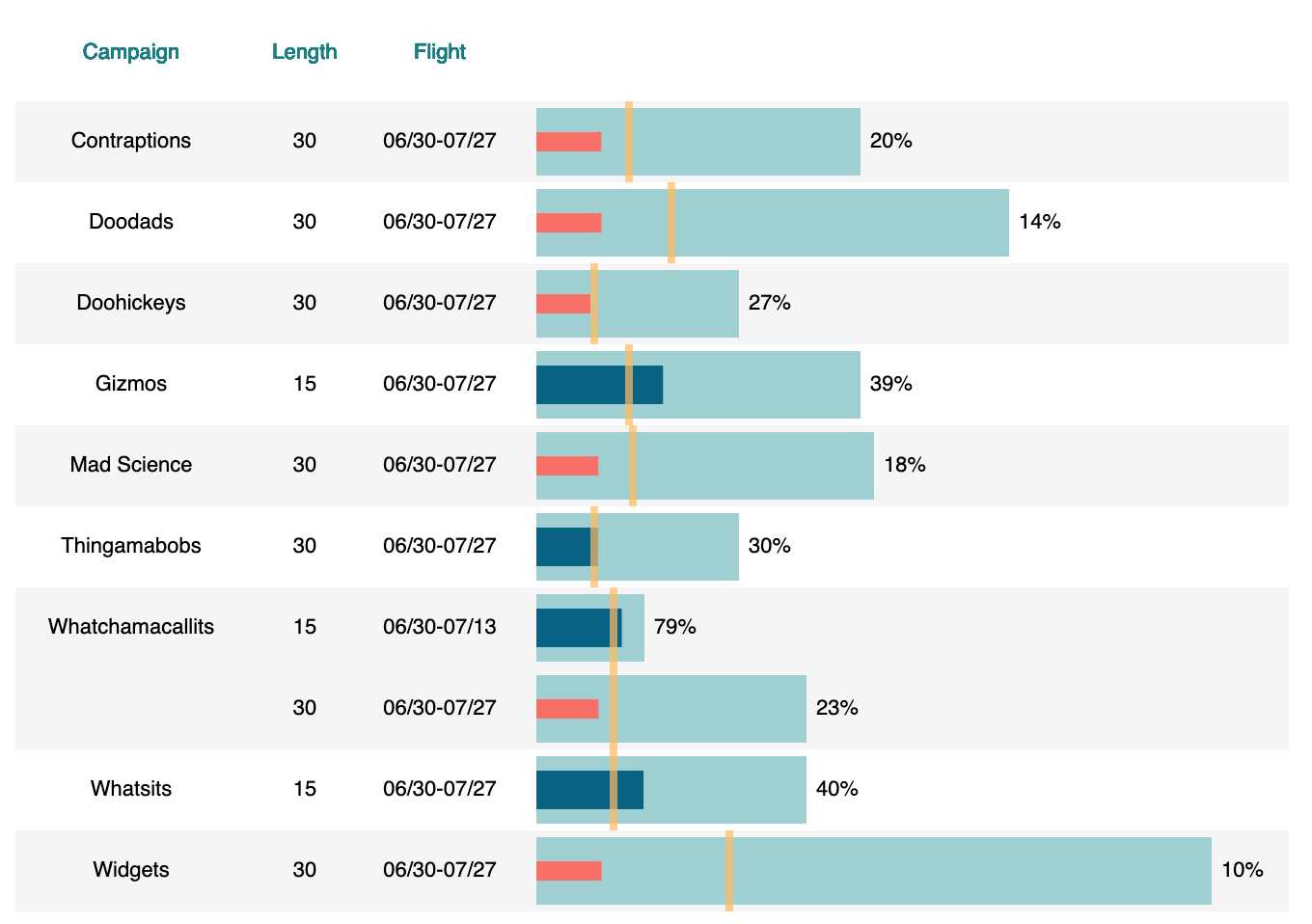
Example dataset:
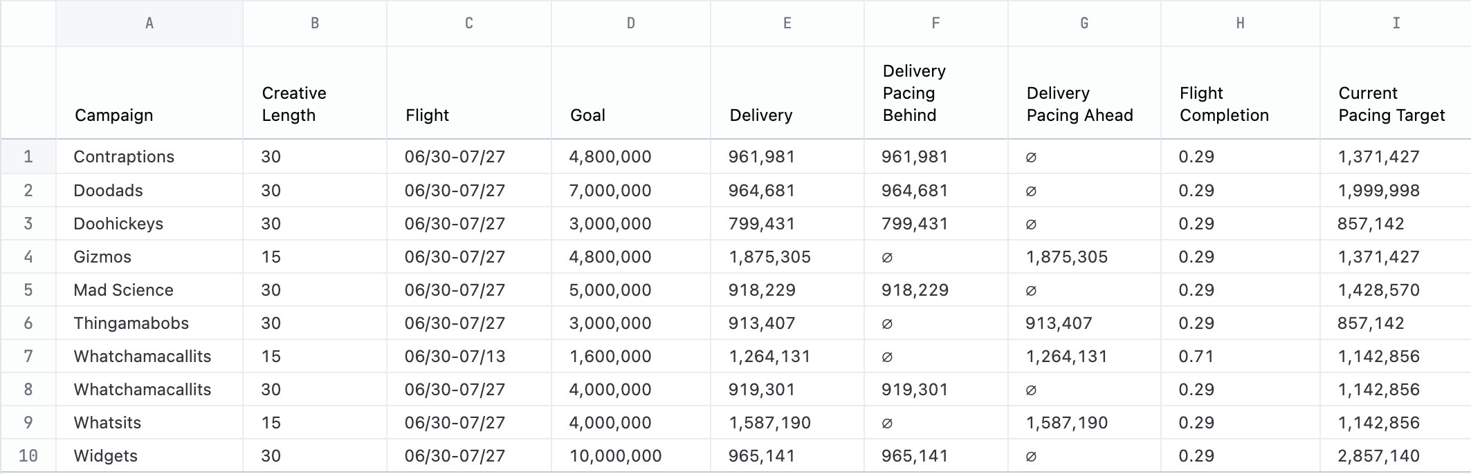
{ "data": { "name": "bullet_chart_data" }, "width": 640, "config": { "bar": { "binSpacing": 10 }, "axis": { "grid": false }, "view": { "stroke": null } }, "$schema": "https://vega.github.io/schema/vega-lite/v5.json", "vconcat": [ { "height": 40, "hconcat": [ { "mark": { "type": "text", "align": "center", "baseline": "middle" }, "width": 120, "encoding": { "x": { "value": 60 }, "y": { "value": 20 }, "text": { "value": "Campaign" }, "color": { "value": "#1a7e83" } } }, { "mark": { "type": "text", "align": "center", "baseline": "middle" }, "width": 60, "encoding": { "x": { "value": 30 }, "y": { "value": 20 }, "text": { "value": "Length" }, "color": { "value": "#1a7e83" } } }, { "mark": { "type": "text", "align": "center", "baseline": "middle" }, "width": 80, "encoding": { "x": { "value": 40 }, "y": { "value": 20 }, "text": { "value": "Flight" }, "color": { "value": "#1a7e83" } } }, { "mark": { "type": "text", "align": "center", "baseline": "middle" }, "width": 360, "encoding": { "x": { "value": 180 }, "y": { "value": 20 }, "text": { "value": "" }, "color": { "value": "#1a7e83" } } } ], "spacing": 0 }, { "layer": [ { "mark": "rect", "encoding": { "x": { "value": 0 }, "y": { "axis": null, "sort": "ascending", "type": "ordinal", "field": "row_id" }, "x2": { "value": 660 }, "color": { "type": "nominal", "field": "is_even_row", "scale": { "range": [ "#f5f5f5", "white" ] }, "legend": null } } }, { "mark": { "type": "text", "align": "center", "baseline": "middle" }, "encoding": { "x": { "value": 60 }, "y": { "axis": null, "type": "ordinal", "field": "row_id" }, "text": { "field": "campaign_display" } } }, { "mark": { "type": "text", "align": "center", "baseline": "middle" }, "encoding": { "x": { "value": 150 }, "y": { "axis": null, "type": "ordinal", "field": "row_id" }, "text": { "field": "bullet_chart_data\\.creative_length" } } }, { "mark": { "type": "text", "align": "center", "baseline": "middle" }, "encoding": { "x": { "value": 220 }, "y": { "axis": null, "type": "ordinal", "field": "row_id" }, "text": { "field": "bullet_chart_data\\.flight" } } }, { "mark": { "size": 35, "type": "bar", "tooltip": true }, "encoding": { "x": { "axis": null, "type": "quantitative", "field": "bullet_chart_data\\.goal", "scale": { "range": [ 270, 620 ] } }, "y": { "axis": null, "type": "ordinal", "field": "row_id" }, "color": { "value": "#a0cfd2" } } }, { "mark": { "size": 10, "type": "bar" }, "encoding": { "x": { "type": "quantitative", "field": "bullet_chart_data\\.delivery__pacing_behind_", "scale": { "range": [ 250, 620 ] } }, "y": { "axis": null, "type": "ordinal", "field": "row_id" }, "color": { "value": "#f97068" } } }, { "mark": { "size": 20, "type": "bar" }, "encoding": { "x": { "type": "quantitative", "field": "bullet_chart_data\\.delivery__pacing_ahead_", "scale": { "range": [ 250, 620 ] } }, "y": { "axis": null, "type": "ordinal", "field": "row_id" }, "color": { "value": "#096184" } } }, { "mark": { "type": "tick", "color": "#ffbb61", "orient": "vertical", "thickness": 4 }, "encoding": { "x": { "type": "quantitative", "field": "flight_marker", "scale": { "range": [ 250, 620 ] } }, "y": { "axis": null, "type": "ordinal", "field": "row_id" } } }, { "mark": { "dx": 5, "type": "text", "align": "left", "baseline": "middle" }, "encoding": { "x": { "type": "quantitative", "field": "bullet_chart_data\\.goal", "scale": { "range": [ 250, 620 ] } }, "y": { "axis": null, "sort": "ascending", "type": "ordinal", "field": "row_id" }, "text": { "field": "pacing_percentage", "format": ".0%" } } } ], "height": 420 } ], "transform": [ { "sort": [ { "field": "bullet_chart_data\\.campaign", "order": "ascending" }, { "field": "bullet_chart_data\\.creative_length", "order": "ascending" } ], "window": [ { "as": "row_id", "op": "row_number" }, { "as": "prev_campaign", "op": "lag", "field": "bullet_chart_data\\.campaign" } ] }, { "as": "campaign_display", "calculate": "datum['bullet_chart_data.campaign'] === datum.prev_campaign ? '' : datum['bullet_chart_data.campaign']" }, { "sort": [ { "field": "bullet_chart_data\\.campaign", "order": "ascending" } ], "window": [ { "as": "campaign_band_group", "op": "dense_rank", "field": "bullet_chart_data\\.campaign" } ] }, { "as": "is_even_row", "calculate": "datum.campaign_band_group % 2 === 0" }, { "as": "flight_marker", "calculate": "datum['bullet_chart_data.goal'] * datum['bullet_chart_data.flight_completion__']" }, { "as": "pacing_percentage", "calculate": "(datum['bullet_chart_data.delivery__pacing_behind_'] + datum['bullet_chart_data.delivery__pacing_ahead_']) / datum['bullet_chart_data.goal']" } ], "description": "Campaign table with suppressed duplicate campaign names and banded rows grouped by campaign."}