Generating visualizations with AI
The JustAsk Agent can automatically suggest and configure visualizations based on your query results, including charts, KPIs, and tables. To learn about building queries with AI, refer to Building queries & filters with AI.
Getting started
Section titled “Getting started”After running a query, you can generate a visualization in one of two ways:
- Prompt the JustAsk Agent directly: describe the visualization you want (e.g., “Show this as a bar chart” or “Create a table with conditional formatting”).
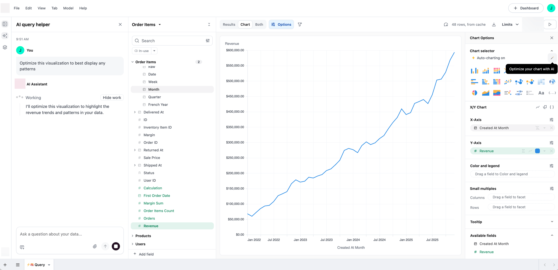
- Use auto-suggest: Click the (wand) icon in the Chart Selector section of the Chart Options panel. This opens the Workbook Agent and generates a visualization suggestion based on the best type for your data.
Once the JustAsk Agent generates a visualization, you can use the chat to refine it further. For example, you can ask the JustAsk Agent to change the chart type, adjust colors, or modify formatting.
Supported visualization types
Section titled “Supported visualization types”The JustAsk Agent can create and configure the following visualization types:
- Charts: Bar, line, area, pie, scatterplot, heatmap, sankey, and other chart types
- KPIs: Single-value metrics with formatting and comparison values
- Tables: Data tables with formatting, conditional styling, and display options
- Funnels: Visualizations showing sequential stages in a process
- Maps: Region maps (choropleths) and point maps for geographic and location-based data
- Markdown: Custom HTML/CSS layouts that combine text, images, data, and visual components like sparklines
Example prompts
Section titled “Example prompts”The following examples demonstrate the types of prompts you can use to create and refine visualizations with the JustAsk Agent.
Creating and changing visualizations
Section titled “Creating and changing visualizations”- “Show this as a bar chart”
- “Convert this to a table”
- “Create a KPI showing total revenue”
- “Show this as a sankey diagram”
- “Create a flow chart from source to target”
Table formatting
Section titled “Table formatting”- “Add bars to the revenue column”
- “Show the image URLs as pictures”
- “Make the website column clickable”
- “Highlight values over 1000 in red”
- “Add a green to red color scale for the score column”
Table styling and options
Section titled “Table styling and options”- “Add row banding”
- “Make the header dark blue with white text”
- “Freeze the first column”
- “Add pagination with 50 rows per page”
- “Group by region”
Chart customization
Section titled “Chart customization”- “Change the colors to blue and green”
- “Add data labels to the bars”
- “Move the legend to the bottom”
Pie and donut charts
Section titled “Pie and donut charts”- “Show this as a pie chart”
- “Create a donut chart of revenue by category”
- “Make this a pie chart with percentages”
- “Show product distribution as a donut chart”
Heatmap charts
Section titled “Heatmap charts”- “Show this as a heatmap”
- “Create a heatmap of sales by day and hour”
- “Display this data as a heatmap with a custom color range”
- “Make a heatmap showing activity by week and day of week”
Map visualizations
Section titled “Map visualizations”- “Show orders by state on a map”
- “Create a region map of sales by country”
- “Show customer locations on a point map”
- “Map revenue by region”
Markdown visualizations
Section titled “Markdown visualizations”- “Create a custom HTML layout for this data”
- “Show this as a formatted text display with sparklines”
- “Create a rich card layout for these results”
- “Build a custom dashboard tile with this data”
Next steps
Section titled “Next steps”- Generating forecasts with AI: Create statistical forecasts for time-series data
- Markdown visualizations: Learn about creating custom layouts with HTML, CSS, and data
- AI summary visualization: Generate AI summaries of query results