Inline
Displays inline with the dashboard content
Advanced layout is a flexible dashboard design system that gives you precise control over how tiles, filters, and controls are arranged. With advanced layout, you can:
Advanced layout is enabled per dashboard. To upgrade an existing dashboard:
Step 1: Open the dashboard in draft mode
Navigate to the dashboard you want to upgrade and click Edit.
Step 2: Enable advanced layout
Click File > Use advanced layout… A confirmation dialog will appear explaining that this is a beta feature.
Step 3: Confirm the upgrade
Click Yes, Upgrade to convert the dashboard to advanced layout. Your existing tiles will be preserved and placed into an initial container.
Containers are the building blocks of advanced layout. A container is a region on your dashboard that holds items and controls how they are arranged, including:
Each container can have a name to help you identify it while editing. To rename a container, select it and edit the Name field in the properties panel on the right side of the screen.
When you add a container to your dashboard, you choose between two layout types:
Grid containers give you free-form positioning. Items can be placed at any position and resized by dragging their edges. This is similar to the classic dashboard layout but scoped to a specific area of your dashboard.
Grid layout is best when you want precise control over where each item sits, such as arranging a set of KPI tiles in an exact configuration.
To use a grid container:
Stack containers arrange items in a single direction, either as a column (top to bottom) or a row (left to right). Items flow automatically and you control spacing and alignment.
Stack layout is best for building structured sections like a row of filters, a column of KPI cards, or a sidebar with controls.
Stack container settings:
column (vertical) or row (horizontal)To use a stack container:
Items within column stack containers can be resized by dragging resize handles, similar to resizing items in grid containers. This allows you to set specific dimensions for individual items while maintaining the automatic flow of the stack layout.
Resized items are sized in pixel values with a minimum size of 12px. Changes are previewed live as you drag and committed when you release the mouse.
Right-click the item and select Reset sizing from the context menu. This removes all explicit sizing properties (width, height, and min/max constraints) and returns the item to its default automatic size.
Use the Add button in the toolbar to add tiles and layout items to your dashboard:
When adding elements from the properties panel using the Add child button, the Page option will not be available since pages are top-level elements.
When editing an advanced layout dashboard, you can undo and redo layout changes using the Edit menu, toolbar buttons, or keyboard shortcuts:
⌘Z (Mac) or Ctrl+Z (Windows) to undo, ⇧⌘Z (Mac) or ⇧Ctrl+Z (Windows) to redoYour undo/redo history is automatically cleared when you make non-layout changes to the dashboard, such as:
After a non-layout change, you won’t be able to undo past that point. This ensures that layout changes and content changes remain independent and prevents conflicts between different types of edits.
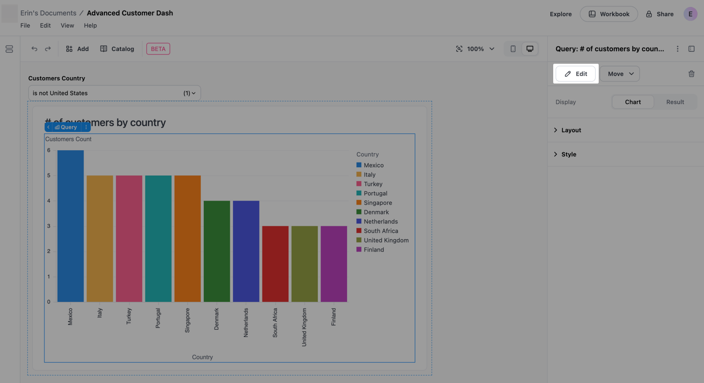
The catalog is a browsable library of all available items on your dashboard. Click the Catalog button in the toolbar to open it.
The catalog displays items in three groups:
Use the search field at the top of the catalog to filter items by name. To place an item, click it in the catalog and then select the target container from the menu that appears.
The catalog is useful for finding items that haven’t been placed yet or for quickly moving items into a specific container without selecting them on the canvas first.
There are several ways to place items into a container:
You can drag items to reposition them within a container or move them between containers. This works for both grid and stack containers.
While dragging, JustAsk provides visual cues to help you place items:
New queries are automatically placed on the first page, items removed can be manually re-added using the catalog.
When you select a chart tile on an advanced layout dashboard, the properties panel will show chart settings inline, allowing you to edit visualization configuration without leaving the layout editor.
To change the chart’s configuration, click the chart and then click the Edit button that displays in the properties panel:
In the properties panel, you can edit the chart’s:
Changes are saved automatically as you work.
For more advanced editing capabilities, click the icon (next to the icon) in the top right corner of the properties panel. This opens the chart in the workbook where you have full configuration options for the visualization.
Advanced layout dashboards can have multiple pages, creating a tabbed experience for viewers.
To add a new page, click Add > Page. Each new page starts with an empty layout where you can add containers and items. Dashboards can have up to 15 pages.
When you add a second page to a dashboard (going from 1 to 2 pages), JustAsk automatically adds page navigation to both pages so viewers can switch between them. If you add additional pages beyond the second, JustAsk copies the page navigation appearance from the previous page to maintain a consistent experience across your dashboard.
Duplicate existing pages in a dashboard to quickly create new pages with the same layout, containers, and content.
The new page will appear immediately after the original page in the dashboard navigation. JustAsk automatically generates a unique name for the duplicated page by appending Copy to the original page name. For example, Dashboard Copy or Dashboard Copy 2.
If the dashboard is going from 1 to 2 pages and the original page doesn’t have page navigation, JustAsk will automatically add page navigation to both pages. If duplicating in a dashboard that already has multiple pages, the page navigation from the original page is included in the duplicate.
To access page settings:
Step 1
Select the page you want to configure by clicking on it or using the page selector in the toolbar.
Step 2
With the page selected, click the icon in the properties panel.
Step 3
Select Advanced settings from the menu.
The Advanced settings dialog will open, where you can configure the following:
Key - A unique identifier for the page. Keys must:
If you enter an empty value, invalid format, or a key that’s already used by another page, you’ll see a validation error and won’t be able to save until the issue is resolved.
While editing, use the page selector in the toolbar to switch between pages. Click the dropdown to see all pages and select the one you want to work on.
When you create a multipage dashboard, JustAsk automatically adds page navigation to let viewers switch between pages. The page navigation widget renders as an inline page switcher that viewers can interact with.
Page navigation is automatically added when:
You can manually add or customize page navigation at any time. To manually add page navigation to a page, click Add > Layout > Page navigation, then place it in a container where you want the page tabs to appear. This is useful if you want to:
Once added, page switchers offer rich editing capabilities to customize how viewers navigate between pages.
Each tab in a page switcher can be edited through a popover interface that provides access to labeling, linking, and configuration options.
To edit a tab:
Step 1: Select the page navigation item
Click the page navigation widget on your dashboard to select it.
Step 2: Open the edit popover
Click the Edit page button on any tab to open its configuration popover.
Step 3: Configure tab settings
In the popover, you can:
Tabs can be reordered using drag-and-drop to match your preferred navigation flow.
To reorder tabs:
The new order persists and will be visible to all dashboard viewers.
Tab labels can be managed in two modes: connected and disconnected.
Connected labels are linked to the page name. When you edit a connected label:
Disconnected labels are custom text independent of the page name. When you disconnect a label:
To relabel a tab:
Step 1: Open the edit popover
Click Edit page on the tab you want to relabel.
Step 2: Edit the label
Step 3: Save your changes
The label updates automatically as you type.
The add menu lets you include existing pages, create new pages, or add custom URL tabs to your page switcher.
To add a tab:
Step 1: Select the page navigation widget
Click the page navigation widget to select it.
Step 2: Open the add menu
Click the Add button (+ icon) in the page switcher.
Step 3: Choose what to add
Select from the available options:
Tabs can be removed from the page switcher without deleting the underlying page.
To remove a tab:
The page remains in your dashboard and can be re-added to the switcher at any time using the add menu.
Custom URL tabs let you add navigation to internal dashboard paths or external resources directly from your page switcher.
Supported URLs:
/dashboard/reports)http:// or https://mailto:Restricted URLs:
For security, javascript: and data: URLs are not permitted and will be rejected.
To add a custom URL tab:
Step 1: Open the add menu
Select the page navigation widget and click the Add button (+).
Step 2: Select Custom URL
Click Custom URL from the add menu.
Step 3: Configure the URL tab
In the edit popover, configure:
Page switchers support multiple tabs pointing to the same page, each with its own label. This is useful when you want to provide different entry points or contexts for the same content.
For example, you might have:
To create duplicate page tabs:
Each tab maintains its own identity and can be edited, reordered, or removed independently.
When you add new pages to your dashboard, they automatically appear in all customized page switchers. This ensures that viewers always have access to newly created pages without requiring manual updates to each switcher.
How it works:
This behavior maintains consistency across your dashboard and reduces the need to manually synchronize navigation widgets when your dashboard grows.
Advanced layout filters support additional display options beyond the standard dashboard filters.
Single selection string filters can be displayed as a row of buttons that users can click to select. This provides a more visual, accessible way to switch between options.
Single selection button options can be displayed in two ways:
Inline
Displays inline with the dashboard content
Popover
Opens in an overlay when clicked
Filters must be in a container to use button options. When a filter option is clicked, the queries connected to the filter will update.
By default, up to the first 50 values for the filter column are used as options. You can customize which values are included using the Values setting described below.
Button options work best with a small number of choices, typically between two and seven.
To configure a string filter for single selection:
Step 1: Add and configure the filter
Step 2: Move the filter into a container
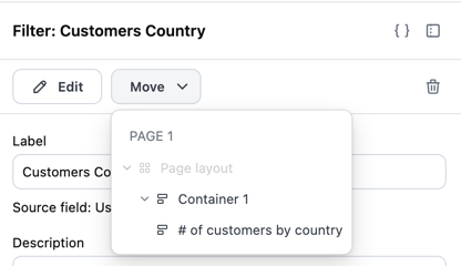
Next, you’ll move the filter into a dashboard container. This is required to access the filter’s single selection options.
At the top of the dashboard, click Catalog, then the filter. This will open the filter’s properties panel on the right side of the page.
In the filter properties panel, click Move.
In the dropdown, select the container you want to move the filter to:
Step 3: Configure single selection options
If the filter properties panel is no longer open, click the filter to open it. 2. Configure the following fields:
String filters can be configured to allow multiple value selection using a dropdown interface. This allows users to select several options at once, making it easy to filter data across multiple categories simultaneously.
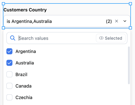
Multiple selection dropdowns always display inline with the dashboard content and provide a clear view of all selected values.
To configure a string filter for multiple selection:
Step 1: Add and configure the filter
Step 2: Configure multiple selection options
If the filter properties panel is no longer open, click the filter to open it. 2. Configure the following fields:
When working with date filters, you can choose how the filter interface appears to users:
Default - The standard date filter interface with range selection and preset options:
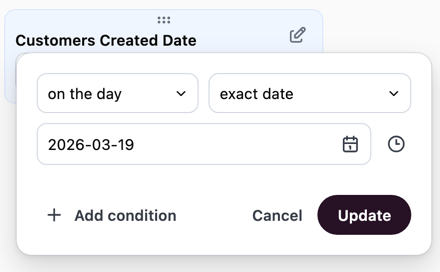
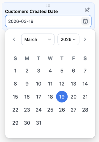
Single day - A simplified calendar interface that allows users to select a specific day. This is useful when you want to focus dashboard viewers on analyzing data for one date at a time, such as daily reports or date-specific snapshots.
After you create the filter, use the Filter type setting to choose a display option.
The timeframe filter control provides a user-friendly way to filter data by common time periods. Instead of selecting exact dates, users can choose from preset options like “Last 7 days” or “Last 30 days”, and optionally define custom date ranges when needed.
This control is useful when your dashboard viewers need to quickly switch between common time windows without navigating a full date picker interface.
To configure a date filter to use the timeframe control:
Step 1: Add and configure the filter
Step 2: Set the filter control type
Step 3: Select preset options
Choose which timeframe options to make available to users. You can select from JustAsk’s preset options or create custom timeframes. The selected options will appear as choices in the filter control.
Step 4: Enable custom timeframe (optional)
Toggle Allow custom timeframe to let users define their own date range when the preset options don’t meet their needs.
When enabled, a custom option appears in the filter. Selecting it will open a custom date range picker.
Advanced layout is in open beta and has the following limitations: